
This post may contain affiliate links. If you buy through them, we may earn a small commission at no extra cost to you. Read our disclosure.
To find your skin undertone after 50, compare colors near your face in indirect daylight. Start with ivory and crisp white, then try camel and cool gray. Write down which fabric you’d wear again. A pattern across several pairs can help you choose tops, scarves and jackets with more confidence.
The six comparisons below use clothes and jewelry you may already own. You’ll also see how to separate warmth from depth, brightness and contrast. These choices often explain why one version of a color works for you and another feels harder to wear.
Affiliate disclosure. As an Amazon Associate I earn from qualifying purchases. These AI-generated visuals illustrate the comparisons. Each image has optional paid links to individual listings or Amazon search results for similar items. You can use clothes you already own.
In this post7 sections
Set up your undertone check
Start with the light you already have
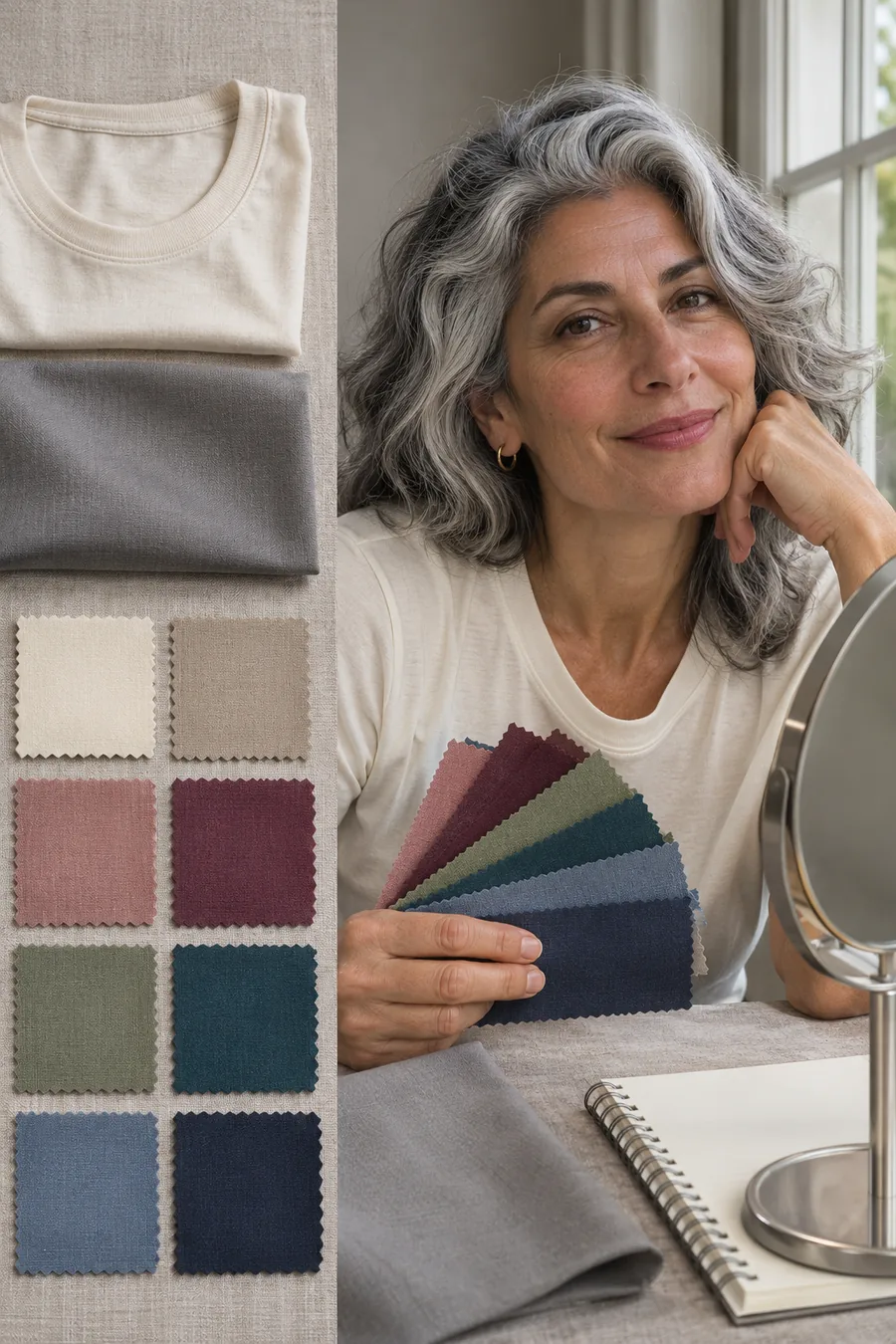
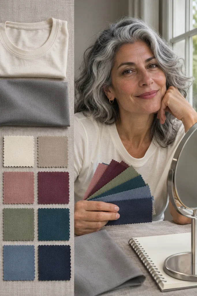
Use a mirror near a window in indirect daylight. Turn off the warm overhead bulb, take off tinted glasses, and use the same makeup for every comparison. If you normally wear foundation and want to know which clothes suit that look, do the tests in it. If you want to compare against bare skin, do the whole round that way. Keep the phone in the same spot if you take photos. Automatic exposure and white balance can shift as you change fabrics, so check the result in the mirror too.
Gather a few things you own: an ivory and a white top, a camel and a gray layer, two colors you can compare, and gold and silver jewelry if available. Similar fabric finishes matter. A shiny silk scarf reflects more light than a matte cotton tee, even when the two colors are close.
What warm, cool, neutral and olive mean here
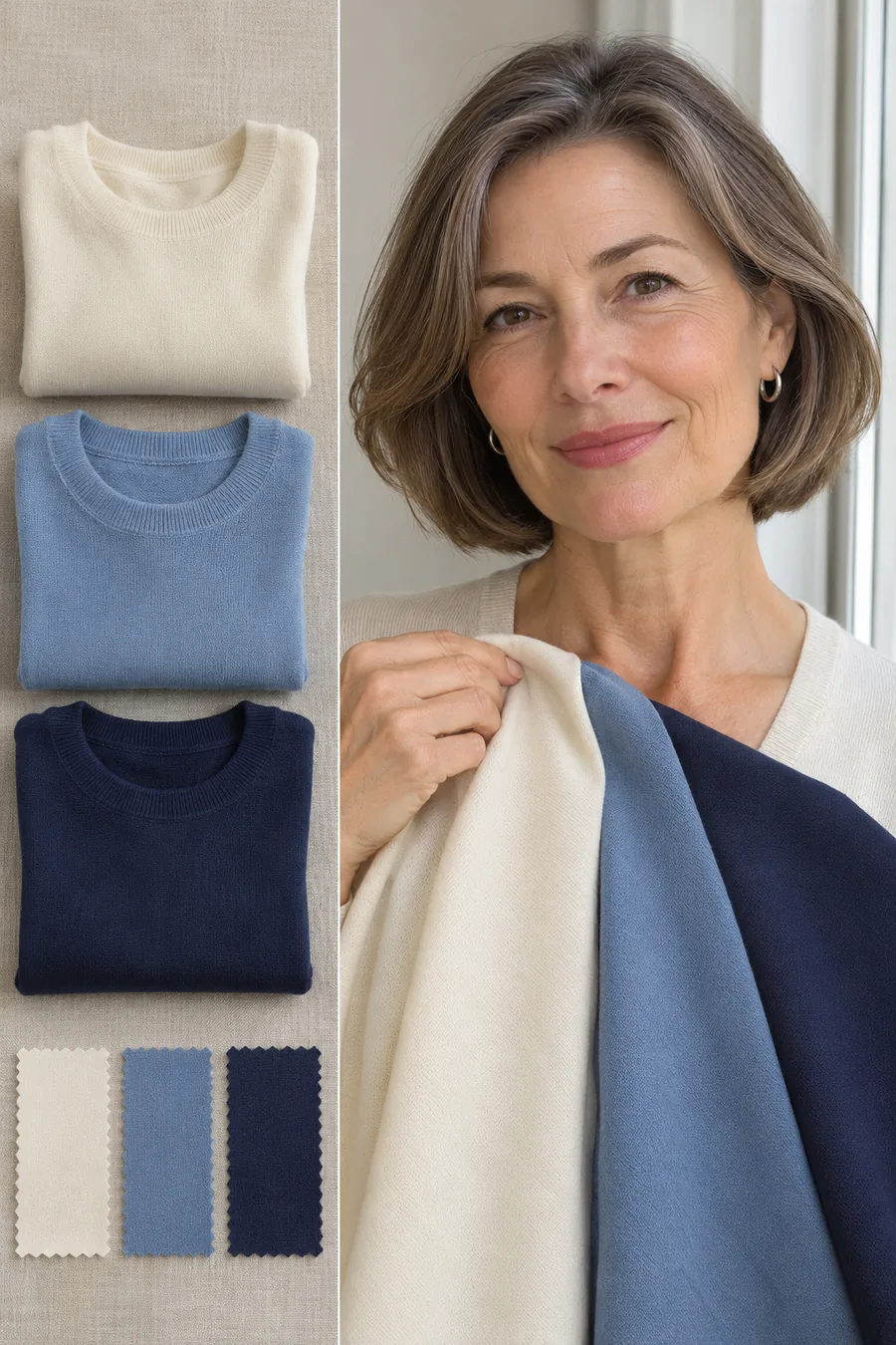
Undertone is a way of describing the subtle color you see beneath the more obvious surface color of your skin. Warm usually describes a golden or peach-leaning cast, cool often describes a rosy or bluish cast, and neutral is a useful label if warm and cool are both workable. Olive describes a greenish or gray-green cast and can occur at different skin depths. It can also read warmer or cooler, so “olive” alone won’t tell you what to put in your closet.
Surface redness, a tan, foundation and room lighting can change what you see. Treat this as a clothing exercise. If you find three tops you like and still can’t name your undertone with confidence, you’ve already got a result you can use.
Six undertone tests you can try at home
1. Compare ivory and crisp white
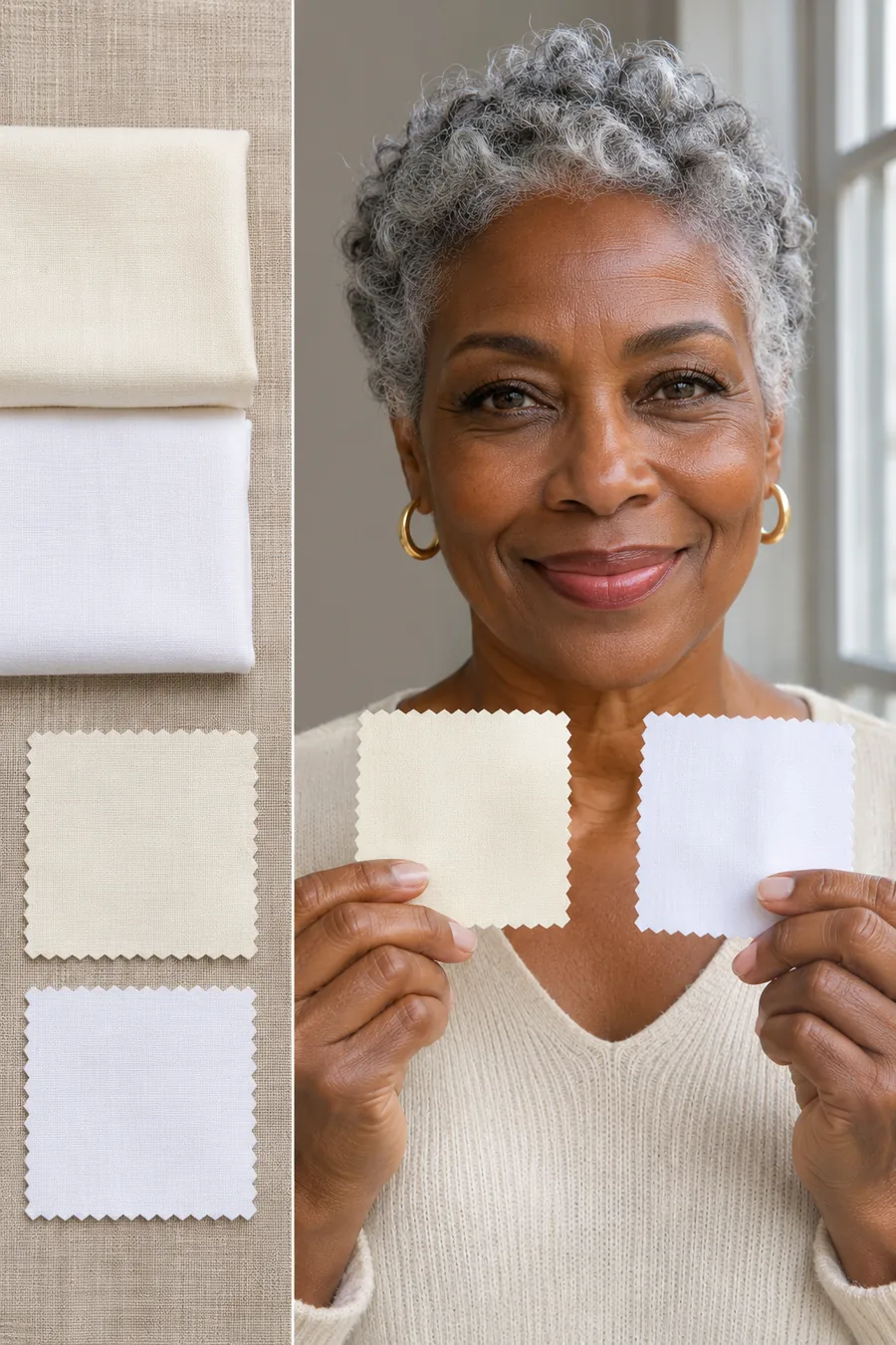
Hold a matte ivory top under your chin, then swap it for a matte optic-white top. Keep the neckline and amount of fabric as close as you can. Look at your features and the whole effect, including your hair. Which white looks balanced next to your face? Which one would you choose if you needed a top for a photo tomorrow?
If ivory looks better in the same light, record one warm preference. If crisp white looks fresher to you, record one cool preference. A tie is useful. One white can be brighter than the other, so repeat the comparison with a softer white if the first one looks unusually stark. This test is a starting point for shopping, and the next pair gives you another piece of evidence.
2. Compare camel and cool gray
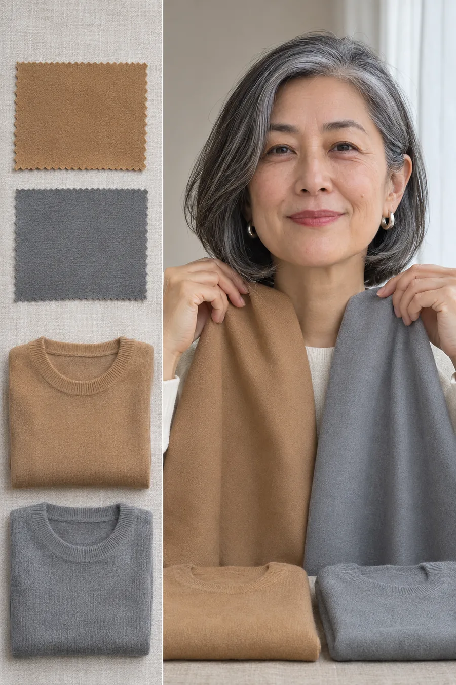
Find a golden camel and a cool gray in roughly the same depth. Lay one over your shoulders, look in the mirror, then swap. Use camel rather than a gray-beige taupe if you want a clear warm example. Compare matte knit with matte knit or smooth woven fabric with smooth woven fabric. Watch whether one color becomes the first thing you notice.
If camel and gray both look good, note where you’d wear each. You might prefer camel in a coat and gray as a sweater. If both feel flat, try a deeper brown and a deeper charcoal. A pale comparison can make it look like warmth is the issue when what you need is a stronger contrast.
3. Compare soft peach and cool rose
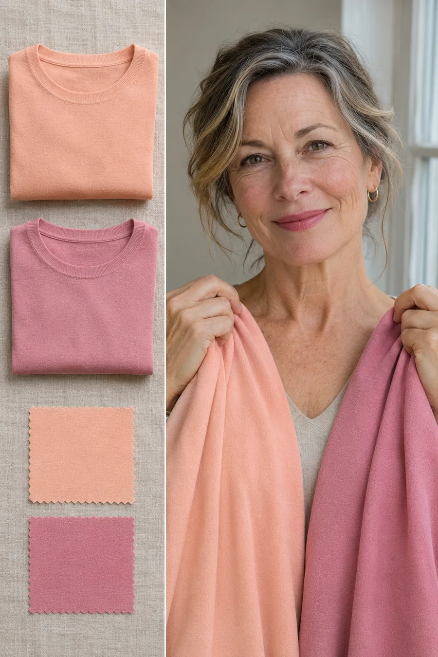
Try a light peach top against a cool rose top of similar brightness. This test can be easier than comparing orange with pink because both colors can sit at the same level of softness. Cover any bright top you’re wearing so it doesn’t show around the edges. Look straight on, then take a quick side view if you’re unsure.
If your cheeks look different from your neck, pay attention to the whole frame rather than matching only the cheek. Give more weight to the color you’d actually like to wear. If both feel too pale, move on to rust and berry for a deeper comparison.
4. Compare rust and cool berry
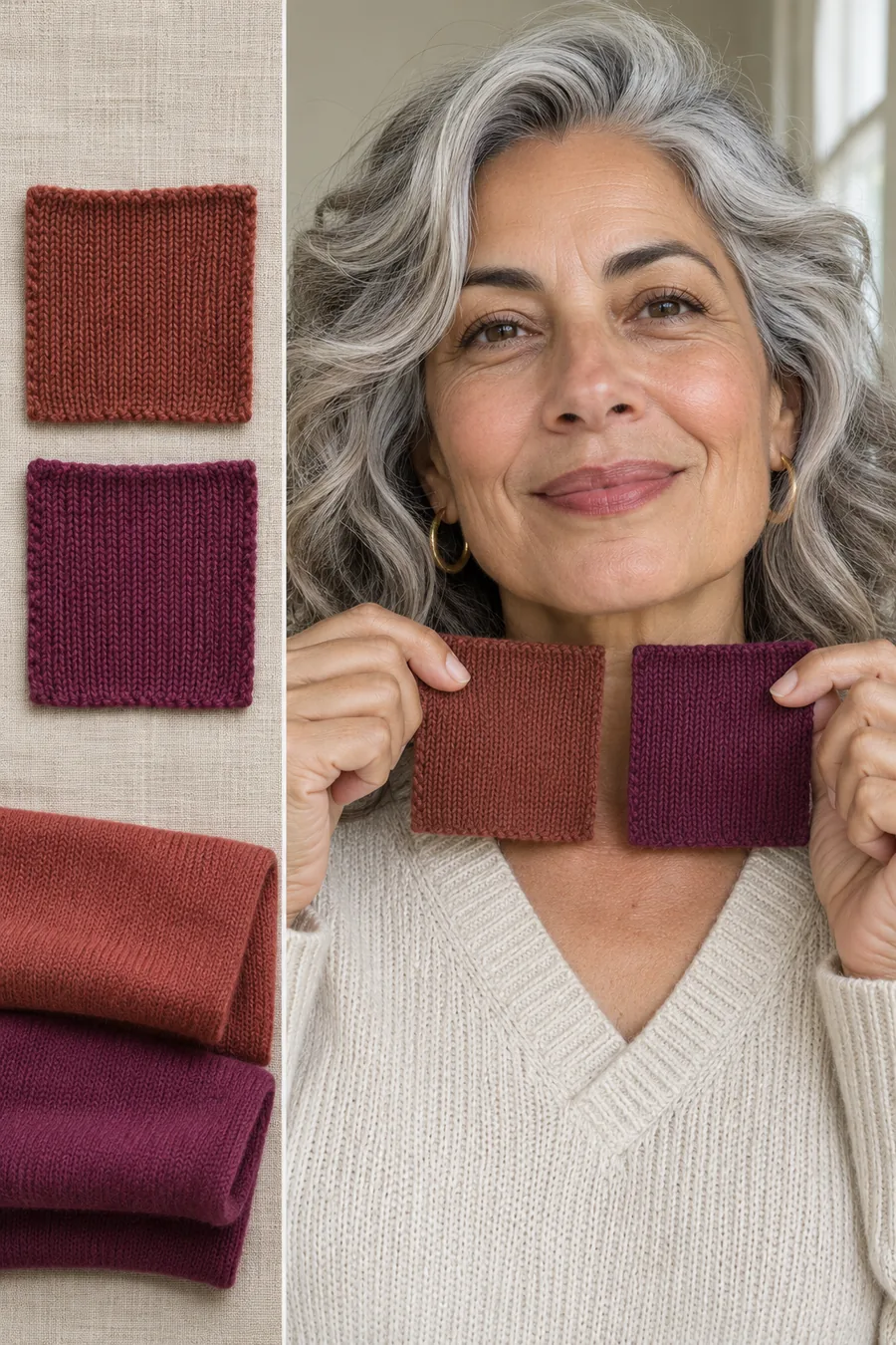
Use a red-brown rust and a blue-leaning berry in similar fabrics. Hold each under your face and notice which makes it easier to see your features without the color dominating. Both are often available as scarves or cardigans, so you may be able to use a pair you already own.
If rust feels good and the peach test was inconclusive, you might prefer deeper warmth over pale warmth. If berry works but bright pink doesn’t, you might prefer deeper or softer cool colors. Write down “rust over berry” or the reverse. This is more useful when shopping than remembering only a category name.
5. Try gold and silver as a supporting clue
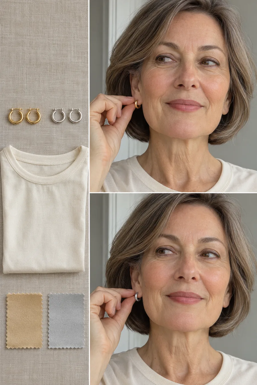
Compare simple gold and silver earrings in similar sizes, shapes and finishes. A large shiny gold hoop naturally draws more attention than a small matte silver stud. Hold the two pieces close to your face while wearing the same top, or compare them on opposite ears and then swap sides to account for the window.
Record what you prefer, but give more weight to the fabric comparisons. Some people like gold jewelry with cool clothes or silver jewelry with warm ones. If you wear both metals and enjoy them, keep both. Your wardrobe can use a practical preference without turning it into a rule for every accessory.
6. Compare green-leaning teal and cool blue
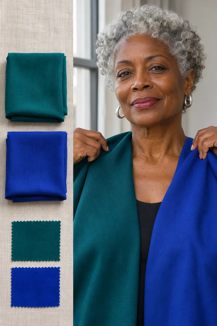
Choose a deep teal that leans green and a cool blue of similar depth. A very bright cobalt and a subdued teal may tell you more about brightness than warmth, so use a softer cool blue if you can. Put the two pieces near your face one at a time, using the same backdrop and posture.
This comparison is useful if you love blue but thought a warm label meant giving it up. Teal, inky navy and blue clothes worn with cream or cognac can still fit a warmer outfit. If the cooler blue is the one you reach for, keep it. Record the actual shade you liked so you can recognize it later.
Read the pattern across your comparisons
| Your pattern | What you noticed | What to try next |
|---|---|---|
| Mostly warm | Ivory over white, camel over gray, rust over berry | Ivory, camel, rust or olive |
| Mostly cool | White over ivory, gray over camel, berry over rust | Soft white, cool gray, berry or navy |
| Mixed or tied | No consistent winner across the pairs | Pick the shades you liked and check depth and brightness separately |
| Both colors felt too strong | A similar result on both sides | Repeat with softer shades or smaller swatches |
| Both colors seemed to fade into you | A similar result on both sides | Repeat with deeper shades and check the contrast with your hair |
For more on observing skin tones in natural light, see Vogue’s guide to skin undertones.
Make sense of mixed results
Check depth separately from warmth
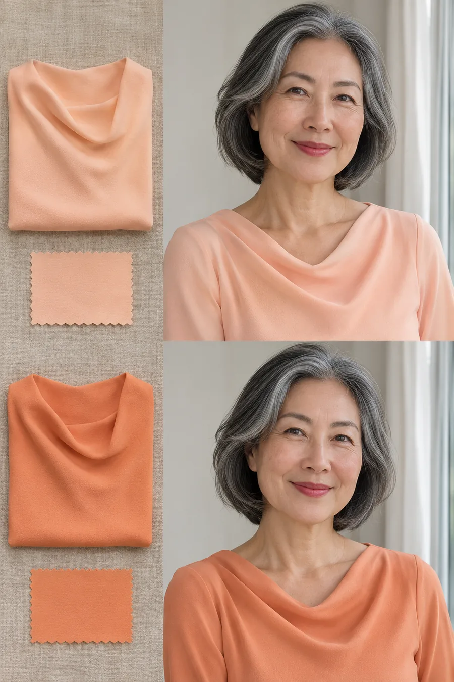
Compare two warm colors, such as light peach and deeper apricot, in similar fabric. If the deeper one looks better to you, try the same idea with cream and chocolate or with light and dark navy. The pattern may be that you want more depth, regardless of whether the color is warm or cool.
Depth is the light-to-dark quality of a color. It helps explain why someone can like a deep brown and a deep blue but dislike both pale camel and pale gray. When you’re shopping, start by looking for the lightness or darkness you know you wear, then adjust the hue.
Check softness and brightness separately
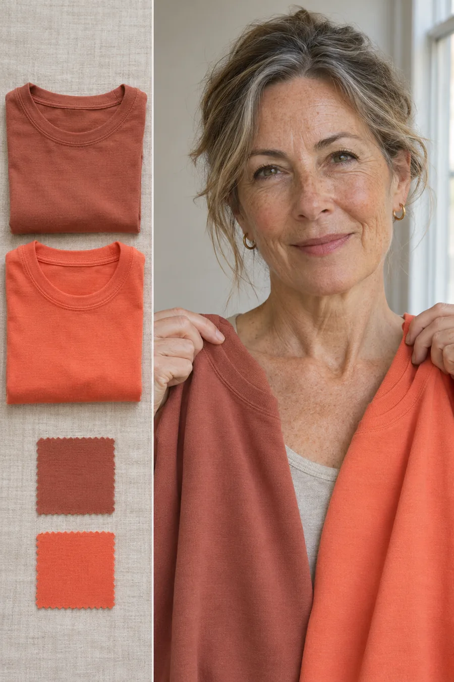
Compare a muted terracotta and a clearer orange-coral of similar depth. One may make the outfit feel quiet while the other gives you a stronger accent. If both lean warm, the comparison gives you a better idea of how much color intensity you want near your face.
Try the same idea on the cool side with dusty rose and a clearer rose. If muted colors keep winning, write that down. If brighter colors make you feel more like yourself, use that information even if your warmth comparisons tied. A useful wardrobe note can be as simple as “deep and muted, usually near my face.”
Look at gray hair and contrast together
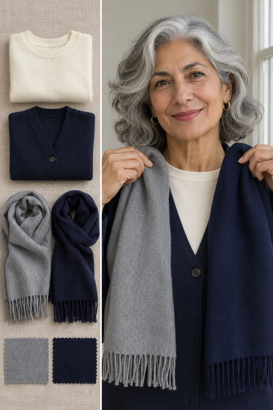
Gray, silver and white hair add a new color to the frame around your face. It can be useful to revisit how much contrast you like between your hair and your top. Try an ivory top under navy, then replace navy with a soft gray layer. Check both combinations in the same daylight.
Pay attention to your preference rather than assuming that silver hair means you must dress cool. One person may enjoy the soft transition of gray with gray hair. Another may prefer the stronger outline of navy. If you want more contrast without changing the whole outfit, use a scarf, a collar or a jacket left open.
Decide which colors need to sit near your face
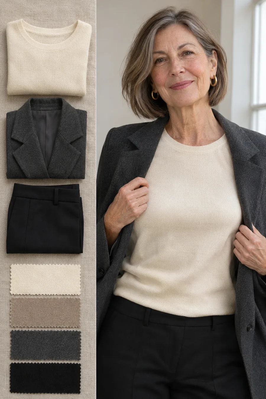
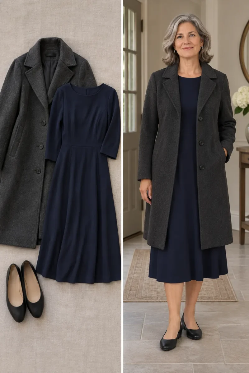
The neckline is where these comparisons are easiest to see. If cream looks better to you than charcoal close to your face, try a cream top under the charcoal jacket. You can keep darker or cooler colors in trousers, shoes and bags. This makes it easier to use the wardrobe you have while testing a different palette.
An open neckline gives you another choice. A color that feels strong in a high crewneck may be easy to wear with a scoop neck or an open shirt over a neutral top. Try the two silhouettes before assuming you dislike the color in every garment.
Use your results to build a wardrobe
Write down three colors you would actually wear
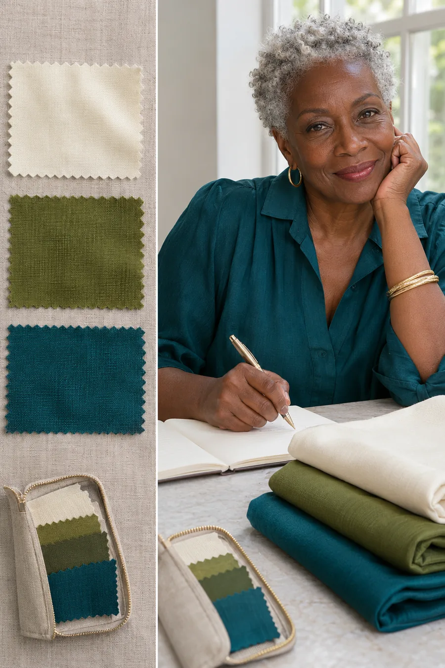
Make three short lists: colors you like at the neckline, colors you prefer farther from your face, and colors you want to compare again. Then pick one light neutral, one dark neutral and one accent. For example, ivory, chocolate and teal are a usable starting set if each looked good in your tests.
Put the three items side by side before you shop. Check that the neutral pieces go with the shoes or trousers you already wear. Keep a daylight photo or a note on your phone. A reference to a real garment is easier to use in a store than a mental picture of a broad shade like beige.
Use your notes when you shop online
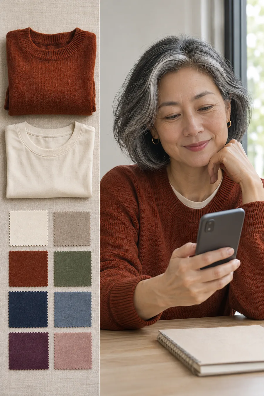
Color names vary across brands. One retailer’s ivory can be another retailer’s cream, and two rust sweaters can sit on opposite sides of red-brown. Read the selected variant before ordering. Compare the swatch with daylight photos when available and check whether the fabric looks shiny or matte.
Buy one useful top or scarf first if you’re testing a new shade. Try it with two pieces from your wardrobe before deciding whether it belongs. If the shade is close but the cut, fabric or neckline feels wrong, judge those separately. A garment can be the right color and still be a piece you won’t reach for.
Build a palette that can mix warm and cool
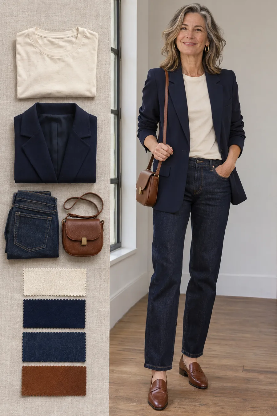
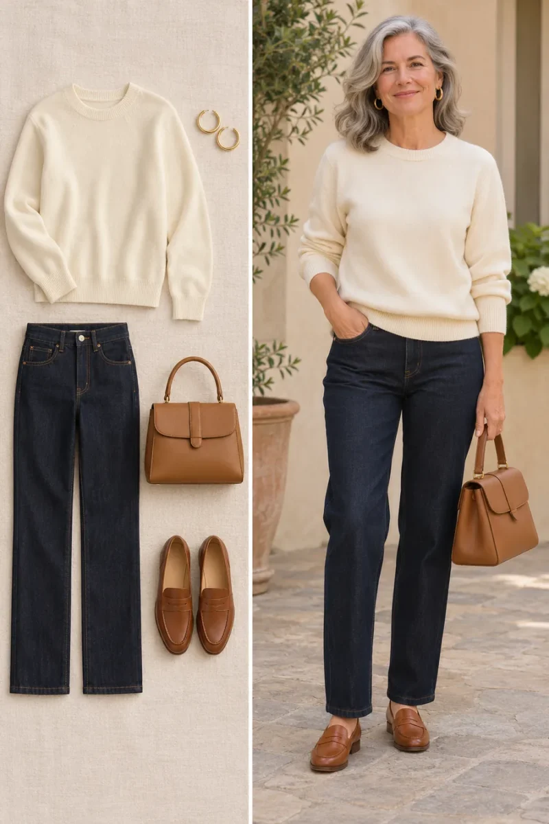
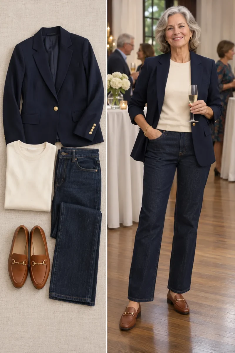
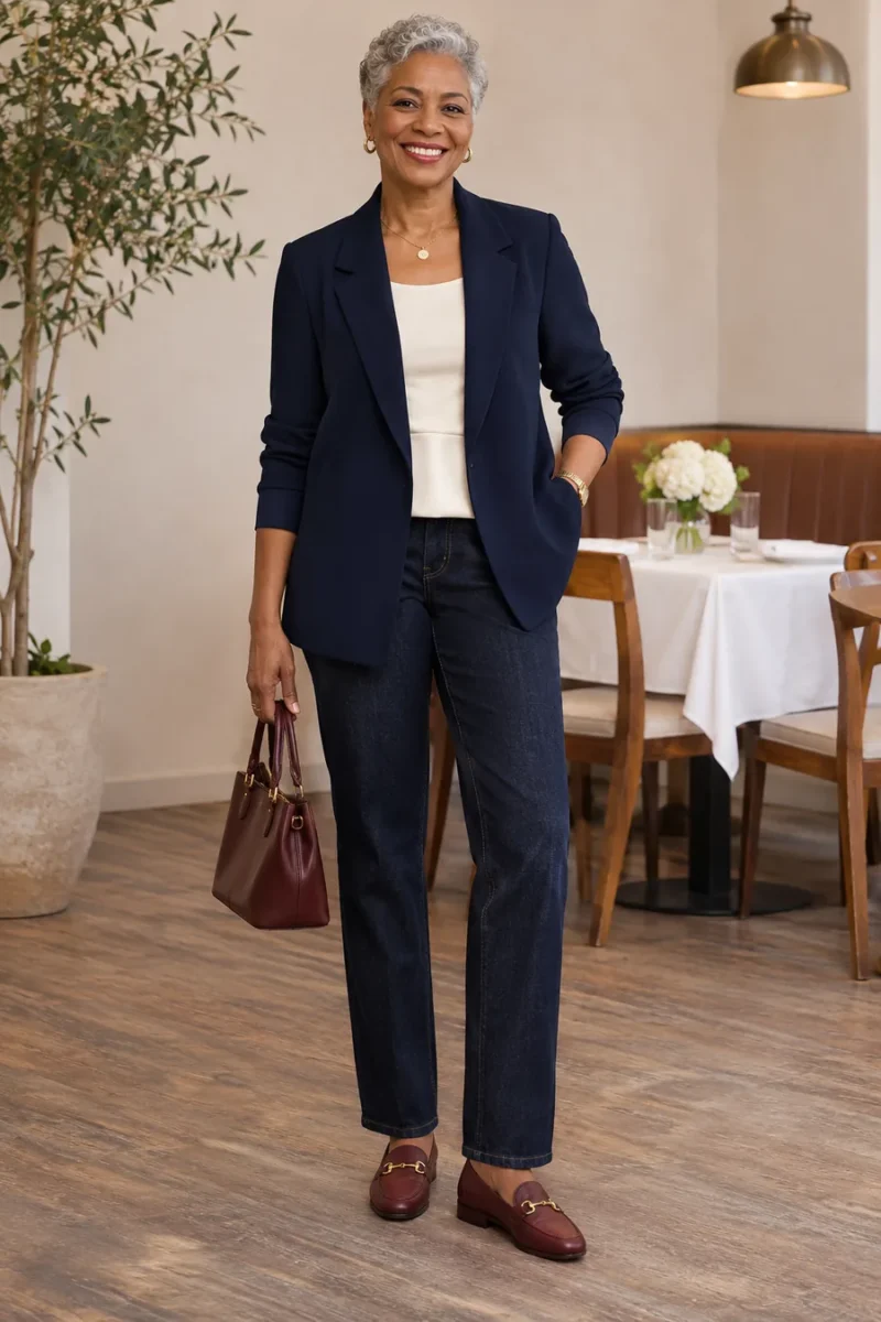
Try a cream tee and cognac loafers with a navy blazer and dark jeans. You get warm touches and a cooler blue in an outfit you can repeat. A similarly simple combination is an ivory top, olive trousers and silver earrings. There’s room to use what you have and keep the comparisons focused on where they help.
If you still can’t tell whether you lean warm, cool or neutral, start with the outfits you wore most over the last month. Find the top you reach for, note its shade and compare one new option with it. You can update that note when your hair color changes, when you try a different contrast or when your preferences change.
Frequently asked questions
Can I use the color of my wrist veins?
You can notice it, but give more weight to actual fabrics near your face. Lighting and how clearly your veins show can make that check difficult to interpret. If the two methods point in different directions, use the comparison that helps you choose a garment.
Can my undertone change after 50?
Your skin’s visible color and your preferred amount of contrast can look different as your hair changes or you change makeup. If old favorites feel different, compare them again in the same light. You can use the new results without needing to decide exactly what changed.
How can I tell if I lean olive?
An olive cast can look subtly green or gray-green, and it can sit alongside a warmer or cooler appearance. If warm and cool labels both feel incomplete, test one muted shade and one clearer shade at the same depth. Keep the colors you like near your face.
Do I have to match my clothes to my undertone?
Use the results as a shopping shortcut. If you love a color that lost a comparison, try wearing it as trousers, shoes or a bag. You can also keep it at the neckline if you like the way it looks.
How many comparisons do I need before shopping?
Two or three good comparisons can be enough for your next purchase. If results tie, take a photo of one top you already love and use it as your reference. You can refine your notes as you wear and wash the new piece.
Find clothes in the colors you liked
If your notes lean warm, browse our warm undertone outfit ideas. If more of the cool shades worked for you, see our cool undertone outfit ideas. You can use both guides to build combinations around pieces you already own.
Leave a Reply