
This post may contain affiliate links. If you buy through them, we may earn a small commission at no extra cost to you. Read our disclosure.
A color can feel as if it washes you out when it’s too close to your skin, too muted for the contrast you like or too strong next to your hair. Start with one change. If beige seems to disappear, try deeper cocoa. If black feels stark, compare navy or open the jacket over a lighter tee.
Affiliate disclosure. As an Amazon Associate I earn from qualifying purchases. These AI-generated images are illustrations. Paid links open individual listings or related Amazon search results. Check the selected shade, fit and fabric before ordering.
In this post6 sections
Choose where to start
| Your starting point | Try this | What to look for |
|---|---|---|
| The color blends into your skin or hair | Go a shade deeper | Beige versus cocoa |
| The color seems dull | Try a clearer shade at similar depth | Dusty rose versus clearer rose |
| The color dominates the outfit | Reduce the amount near your face | An open jacket or a smaller scarf |
Ten color swaps you can compare in daylight
Near-skin beige → cocoa
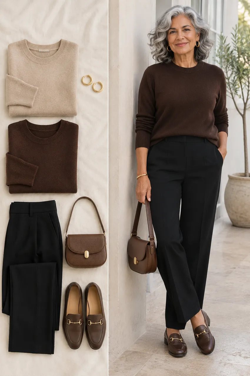
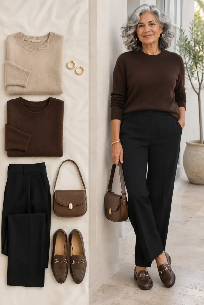
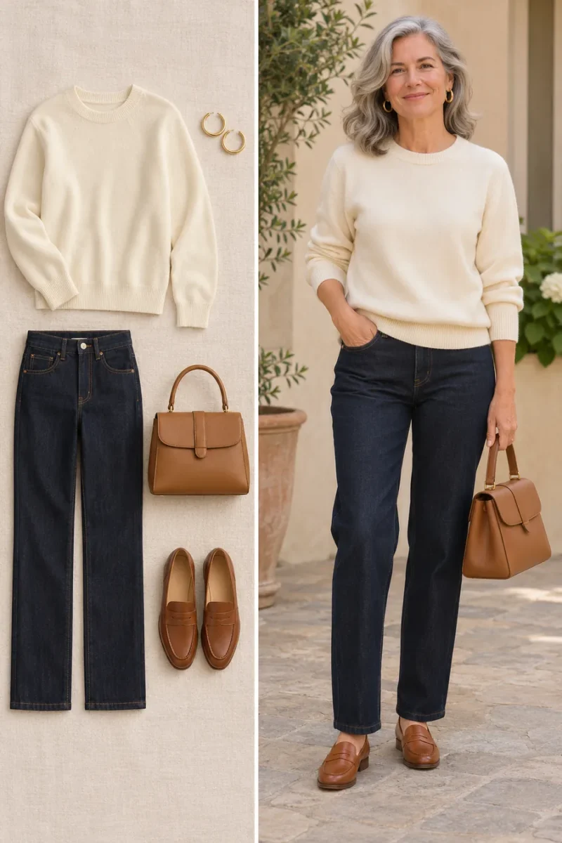
If a beige sweater seems to blend into your skin, compare it with a deeper cocoa of similar warmth. Pair either with black trousers and brown loafers. The cocoa gives the neckline a visible edge while keeping the outfit warm.
If you still like the beige, wear it in a coat over a stronger top or add a brown scarf. Changing its placement can be enough.
Pale gray → charcoal
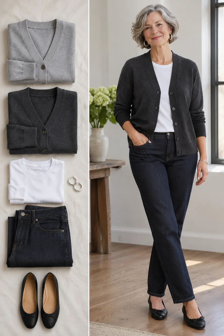
Compare pale gray and charcoal cardigans over the same white tee and dark jeans. A deeper gray can give pale hair or a soft complexion more definition. If charcoal feels too heavy, try a medium slate.
Leave the cardigan open and check how much white shows. A white tee breaks up the gray and lets you adjust contrast without buying a different layer.
Buttery cream → soft white
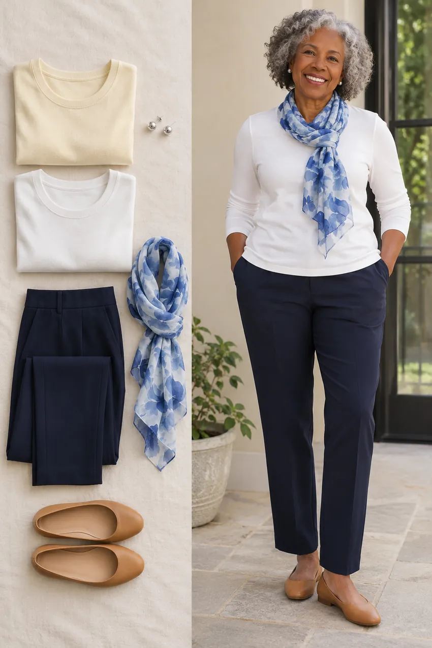
Compare buttery cream and soft white with the same navy trousers. If yellow cream makes the overall look seem dull, a less yellow white may feel clearer. Compare matte fabrics so sheen doesn’t decide for you.
Try a blue scarf with the soft white if you want more color. If you prefer cream, keep it and see whether navy or a deeper blue next to it gives you the contrast you wanted.
Dusty pink → berry
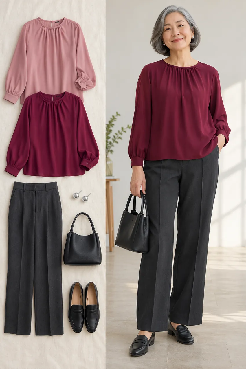
Dusty pink can look quiet or disappear, depending on the person and the light. A berry blouse adds depth to the same charcoal trousers. Hold both near your face before changing the rest of the outfit.
If berry dominates, try a medium rose. For a layered look, wear the dusty pink you own under charcoal and see whether the darker frame gives it enough definition.
Muted sage → deep teal
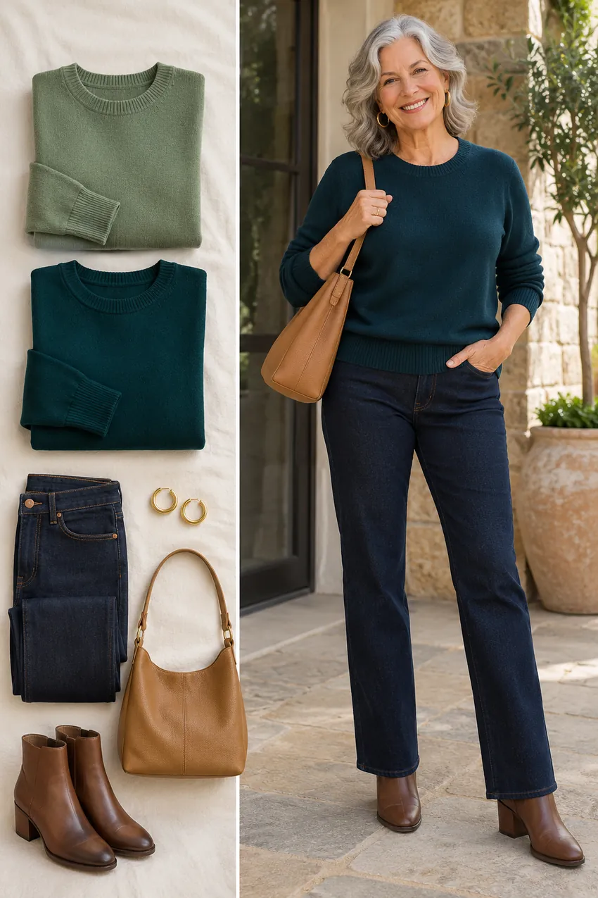
If a muted sage knit looks gray in a mirror, try a deeper teal with the same denim and brown boots. Teal makes a stronger focal point. Test a greener and a bluer version if the first shade feels off.
For a softer look, keep sage in trousers or a bag and wear teal or ivory at the neckline. You can still use the quiet green without relying on it to provide the contrast.
Pale blue → medium blue
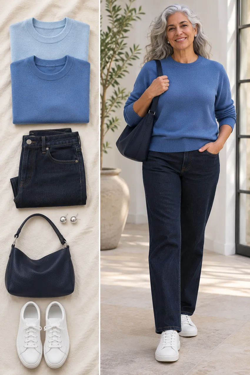
A pale blue sweater can work beautifully with dark jeans. If it fades beside your face, compare it with a medium blue of similar coolness. Keep the shoes and jeans the same while you decide.
Check both near a window and at the distance you’d see in a group photo. If the pale color is the one you like, a navy scarf or a visible white collar can change the balance.
Mustard → rust or muted gold
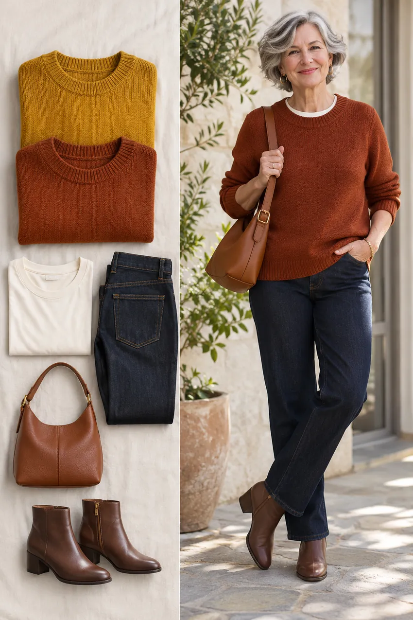
If a yellow-green mustard makes the whole outfit feel dull, try a redder rust over the same cream tee and dark denim. Compare a softer warm gold if you want to stay in the yellow family.
Look at the color against your skin and against the cream separately. A mustard cardigan that feels strong buttoned may look balanced open with the lighter tee showing.
Jet black → inky navy
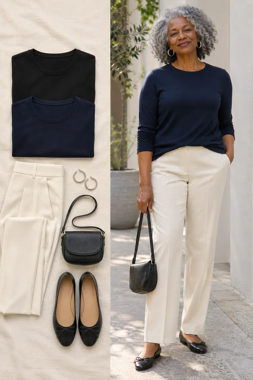
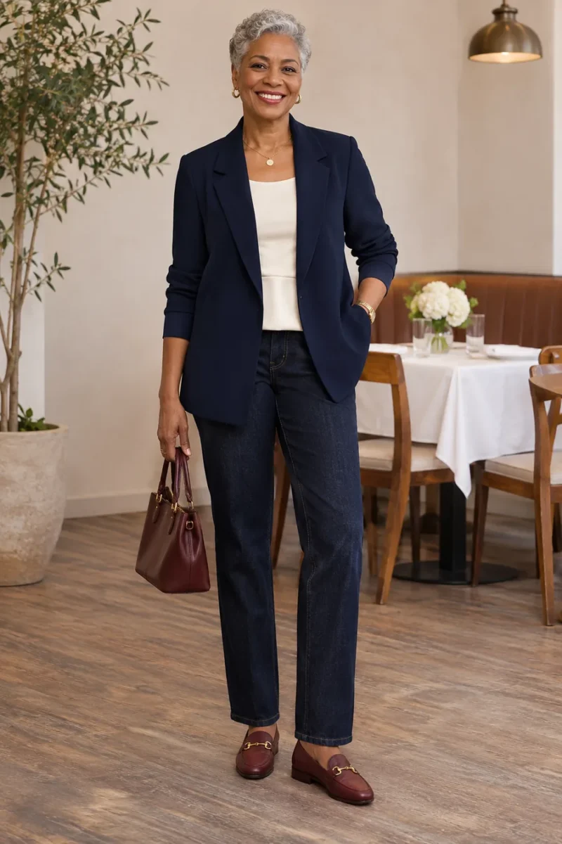
If solid black at the neckline looks harsher than you like, compare it with inky navy of similar depth. Use the same ecru trousers and flats. A navy that is clearly blue in daylight usually gives you a meaningful comparison.
If both are too dark, move to mid-blue or keep the dark layer open over a lighter tee. If you like the stronger contrast of black, it can still be a reliable base.
Neon → a clear midtone
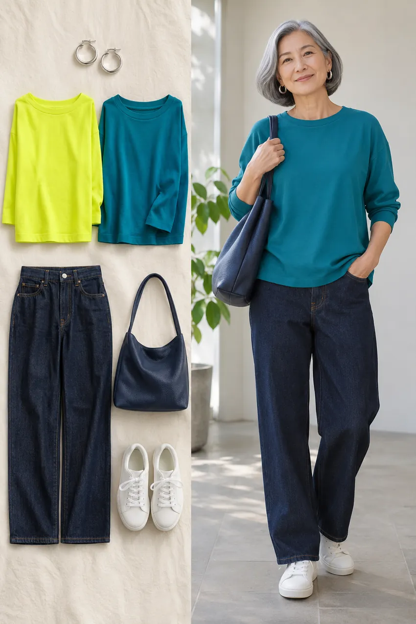
If a fluorescent shade shows up in the mirror before anything else, try a clear medium teal or blue. You still get visible color, with less intensity. Pair it with dark denim and simple sneakers.
You can keep neon as a small accent if you enjoy it. Try a narrow stripe, a bag or a small scarf and see how the smaller patch changes the look.
Very pale ivory → deeper ivory
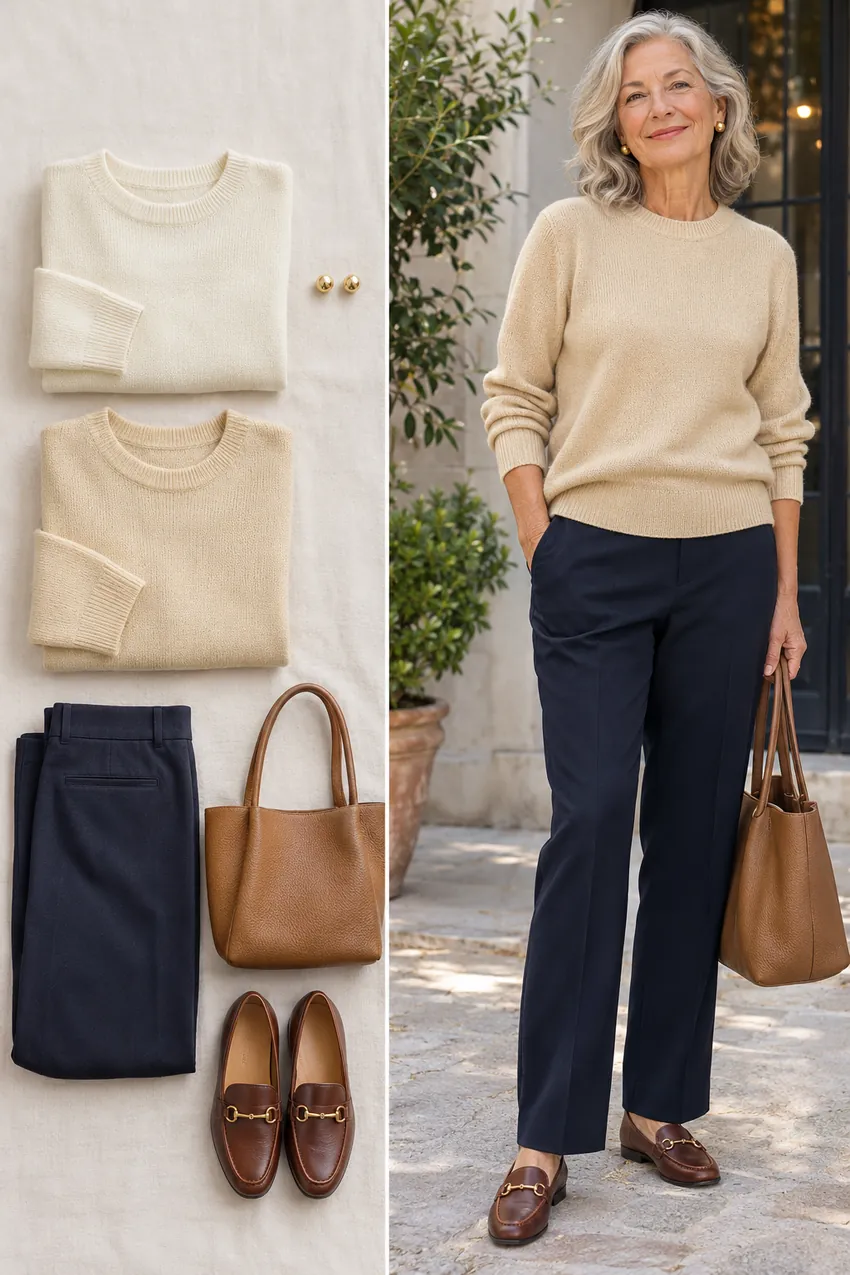
Two ivories can behave differently. Hold a nearly white knit against a slightly deeper ivory in the same light. If the pale one feels flat, the deeper version may bring just enough color without changing the overall palette.
Use navy trousers and a brown shoe with both. Repeat the comparison under the light you expect at the event. An evening bulb can make a cream shade look warmer.
Five ways to work with colors you already own
Give oatmeal a clear accent
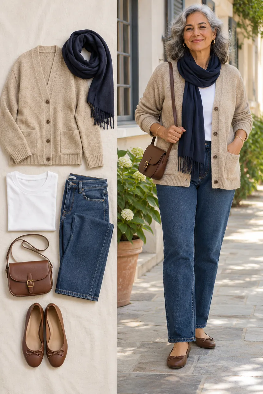
If oatmeal works as a layer but feels vague at the face, try a white tee and navy scarf. The dark scarf gives the neckline an outline, and the cardigan can stay as a soft backdrop.
Remove the scarf and compare. If only a little dark color helps, a thinner scarf or visible navy collar may work better than a full dark top.
Add a berry scarf to a gray coat
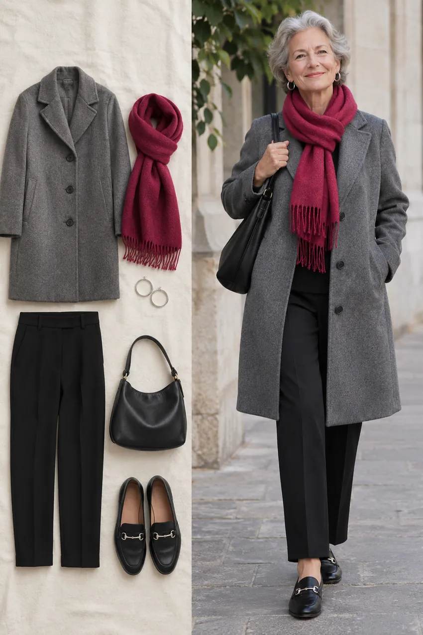
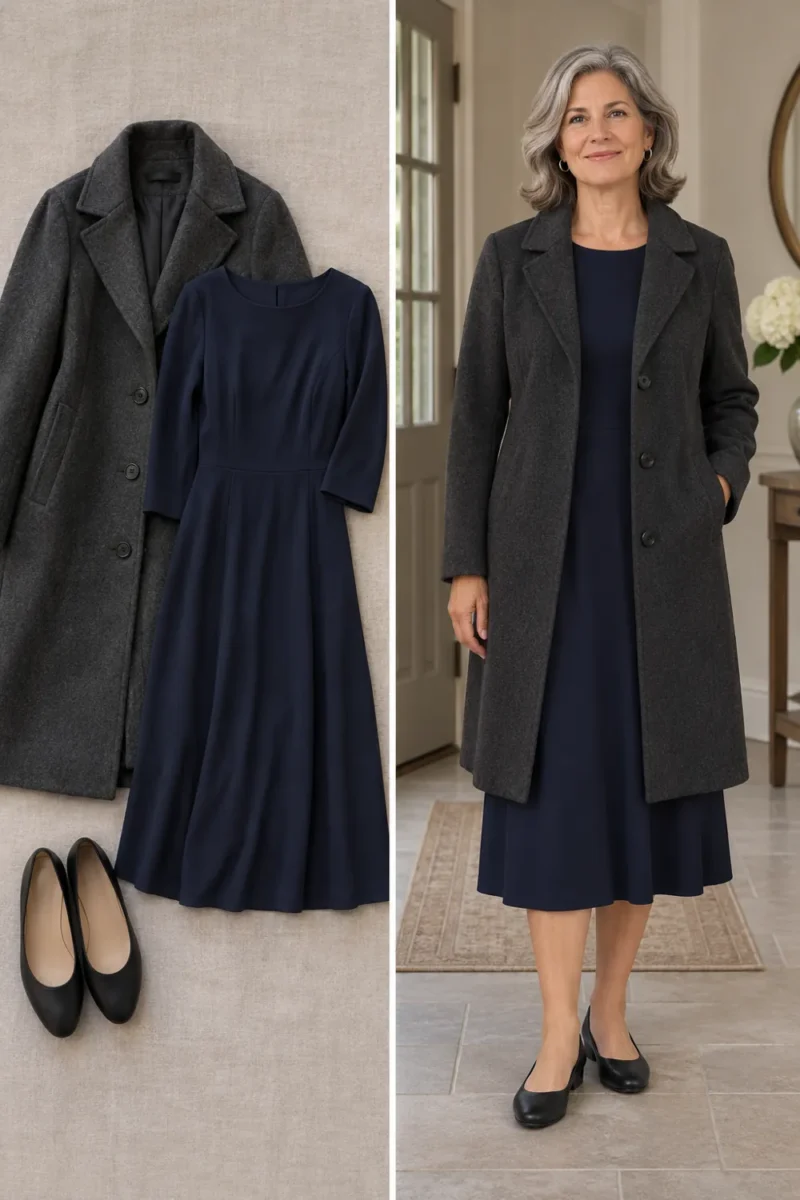
A gray coat can be useful even if a gray neckline feels quiet. Wrap a raspberry scarf once and keep the coat open enough for it to show. Repeat the deeper neutrals below with black trousers and loafers.
Hold the scarf farther from your face if the full area of color feels strong. The same accessory can sit lower at the collar or on a bag.
Open up a black blazer
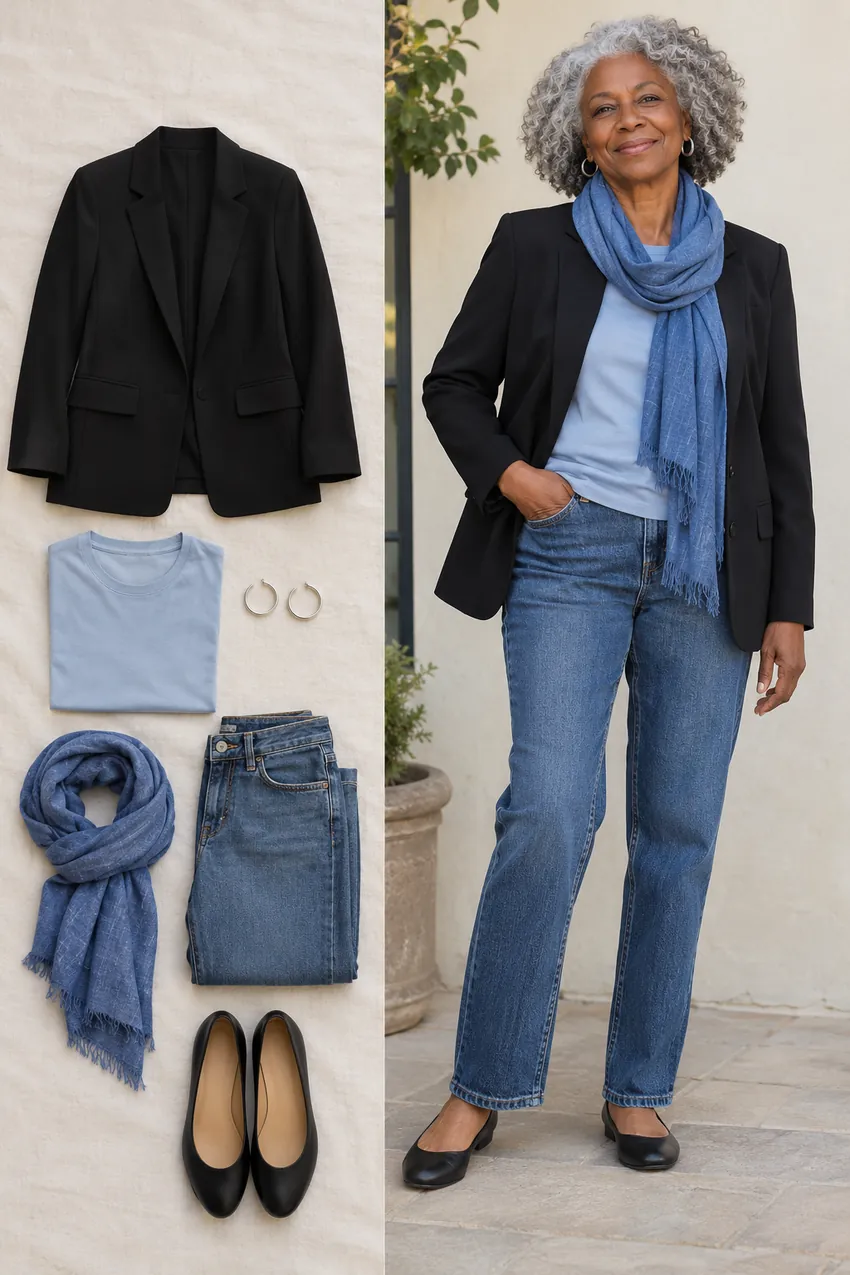
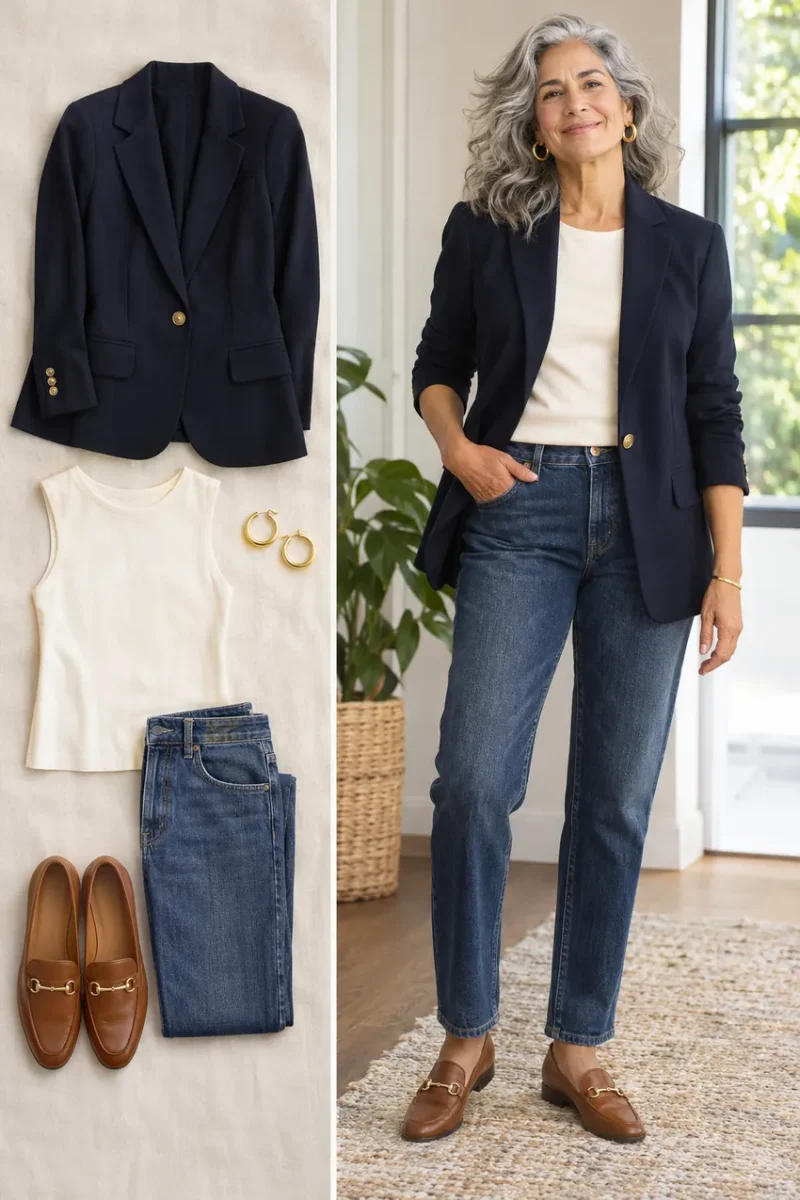
If a black blazer feels too dark against your hair, leave it open over pale blue. A blue scarf can sit at the neckline if you want more of that color. Dark jeans and black flats keep the outfit easy to repeat.
Button the blazer, then open it again in the same light. If the open version works, the amount of dark fabric was part of the issue. You can apply the same test to other jackets.
Give a tonal outfit definition
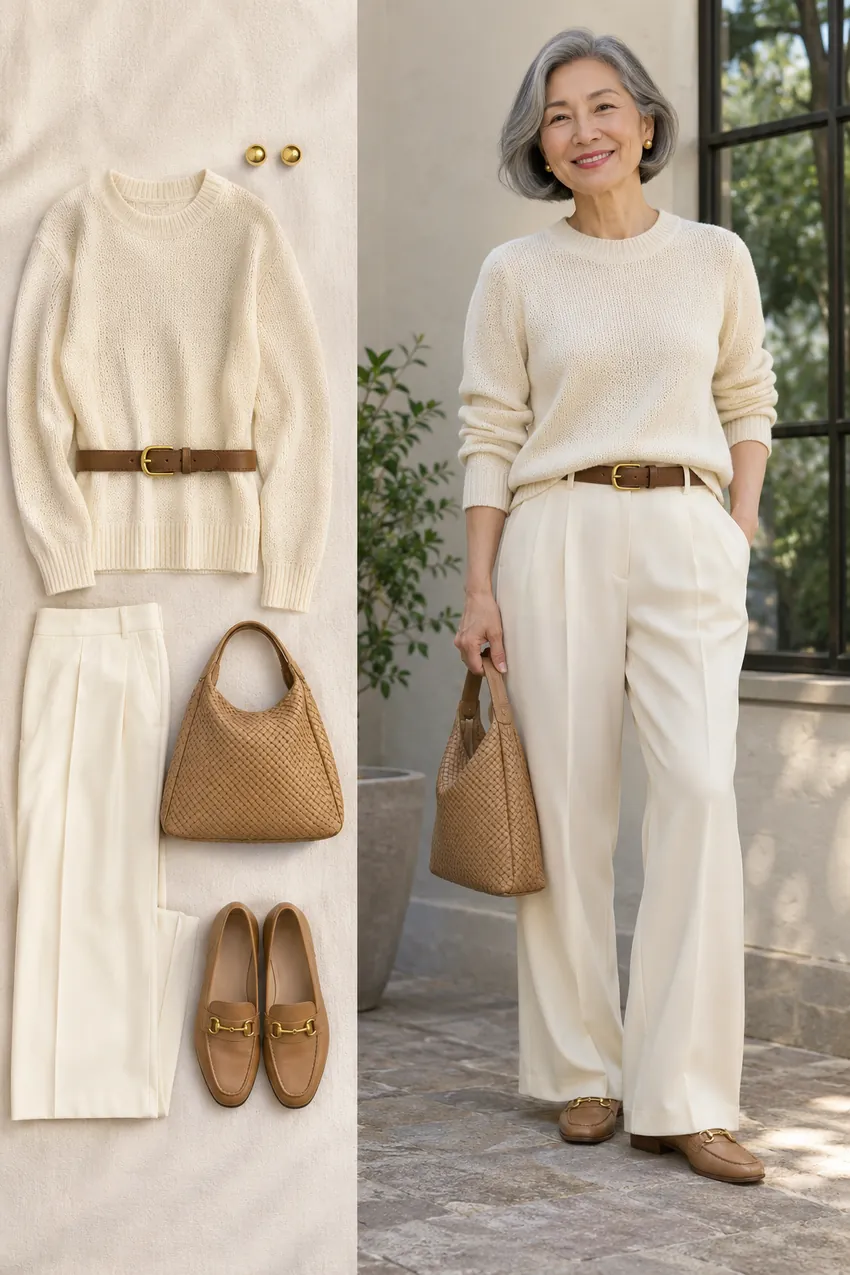
Cream and ivory can look deliberately soft. If the outfit seems to lose its shape, use a brown belt, a textured bag or a slightly darker shoe. You can keep the top and trousers in the same light range.
Take a photo before and after adding just one darker piece. This shows whether the outfit needed a clearer shape, even if the original neckline color already worked.
Keep a test outfit you can repeat
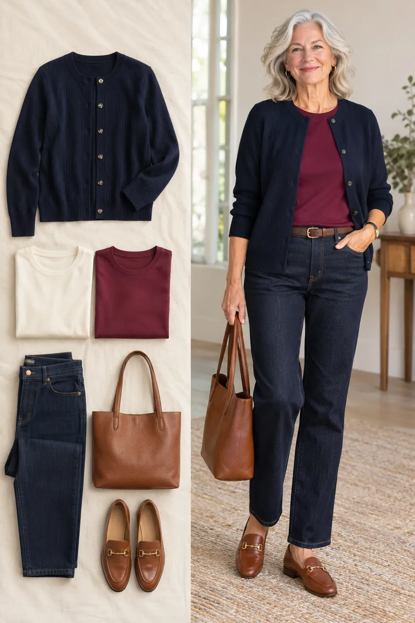
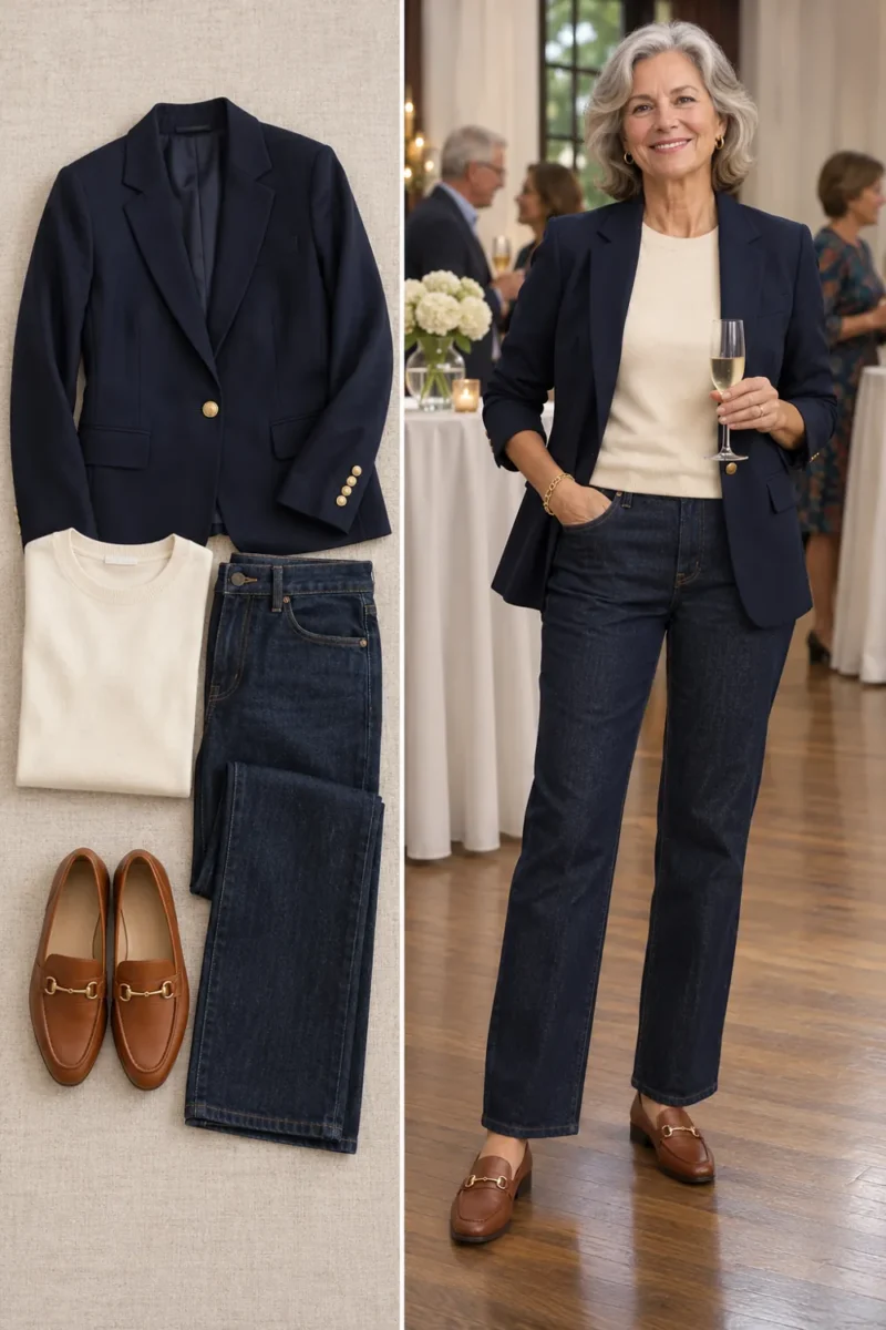
Choose a navy layer and jeans that you wear often. Swap one neckline piece at a time, such as ivory and berry, with the same hair, makeup and light. Make a note of which combination you’d wear again.
If neither top works, change the depth before changing the whole palette. A useful result might be that medium shades look better than either a very pale or very dark top.
Try the colors with clothes you own
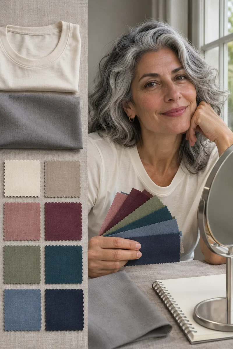
Change only one variable. Compare two matte fabrics near a window. Keep your hair, makeup and trousers the same. If you change depth and brightness at the same time, repeat with a closer pair to see which made the difference.
Use the color somewhere else. Move a pale or very bright shade to a skirt, trousers or bag. If you like it as a layer, open the jacket over a neckline color you prefer. That keeps the part of the outfit you already enjoy.
Take a photo at normal distance. A mirror close-up shows fabric and skin in detail. A photo from across the room shows the entire outline. Check both before changing a jacket or getting rid of a sweater you still like to wear.
Frequently asked questions
Which colors always wash out women over 50?
There is no one list for everyone. Compare the depth, warmth and brightness of a color with something you already enjoy wearing.
Does gray hair mean I need stronger colors?
You may like a different amount of contrast as your hair changes. Compare pale gray and charcoal or soft blue and navy before deciding.
Leave a Reply