
This post may contain affiliate links. If you buy through them, we may earn a small commission at no extra cost to you. Read our disclosure.
To find your color season after 50, compare three things in clothes near your face: warm versus cool, light versus deep, and muted versus clear. Then try a complete outfit from the seasonal family that fits most of your preferences. Gray hair is useful to consider when you adjust contrast, but you can begin with the clothes already in your wardrobe.
The four-season system is a styling tool. Use the spring, summer, autumn and winter palettes below as starting points for a set of colors you enjoy wearing. You can leave a label undecided and still come away with a better shopping list.
Affiliate disclosure. As an Amazon Associate I earn from qualifying purchases. The AI-generated images illustrate clothing comparisons and outfit ideas. Paid links open individual listings or Amazon search results for similar items. You can use clothes you already own for these comparisons.
In this post9 sections
The four color families at a glance
| Starting family | Color qualities | Accent ideas | Neutral ideas |
|---|---|---|---|
| Spring-inspired | Warmer and clearer | Peach, light warm green, warm coral | Ivory and tan |
| Summer-inspired | Cooler and softer | Dusty rose, lavender, soft blue | Soft gray and navy |
| Autumn-inspired | Warmer and more muted | Olive, rust, moss | Chocolate and camel |
| Winter-inspired | Cooler and clearer | Cobalt, emerald, strong berry | Charcoal, black and crisp white |
Prepare a useful comparison
Begin with a color you already choose
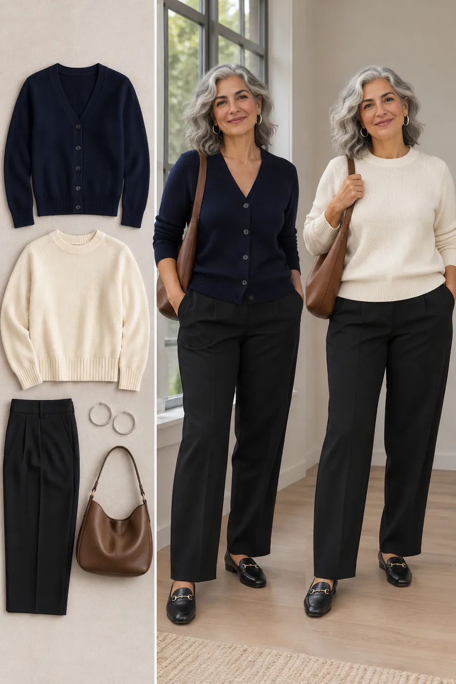
Take out a top you enjoy wearing, including one you’ve owned for years. Try it beside a window with your usual hair and makeup. Write down its color, how light or dark it is and whether it looks soft or clear. A navy cardigan, for example, might be deep and slightly muted. An ivory knit might be light and warm.
This gives you a real reference before you try to name a season. You can use the reference to compare a new top in a store or check an online swatch. Your most useful result may be a short description of colors you wear easily.
Set up a fair comparison
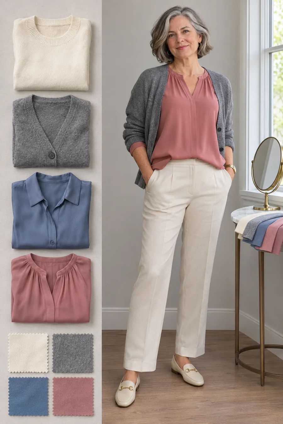
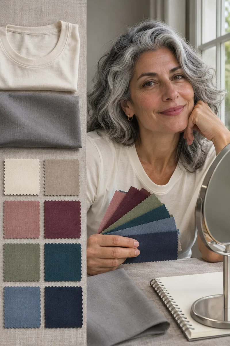
Use indirect daylight and a simple background. Turn off a strong yellow overhead light and remove a brightly colored scarf or top that could reflect onto your face. Hold the fabrics below your chin with about the same amount showing. Use matte fabrics for the first round so shine doesn’t change the comparison.
Check the mirror as well as any photos. A phone can change exposure or white balance when you move a fabric. If a result is very close, repeat it another day in similar light. You can leave a pair undecided and still use the comparisons that gave you a clear preference.
Four checks to narrow your choices
1. Compare warm and cool colors
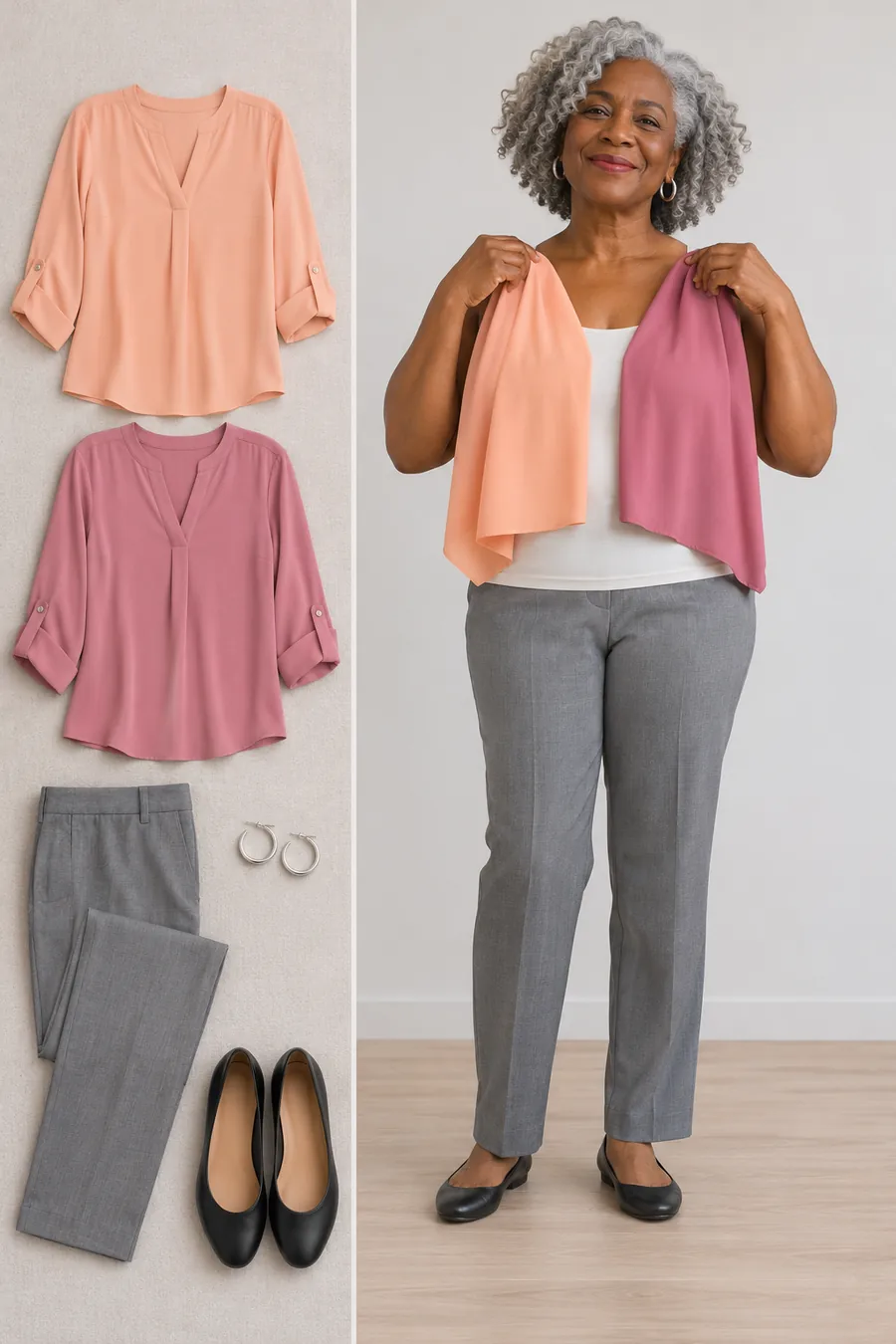
Start with peach and cool rose of similar depth. Then try camel and cool gray. Keep the amount of fabric, light and neckline the same. Notice which version looks balanced with your skin, hair and brows. Record the pair you preferred rather than trying to make a season label fit immediately.
Warm colors include yellow- or peach-leaning shades. Cool colors often have a blue or rosy cast. If you like both, you may have room for a mixed palette. If one pair ties, use another before making a decision. For more examples, see the undertone guide linked below.
2. Compare light and deep colors
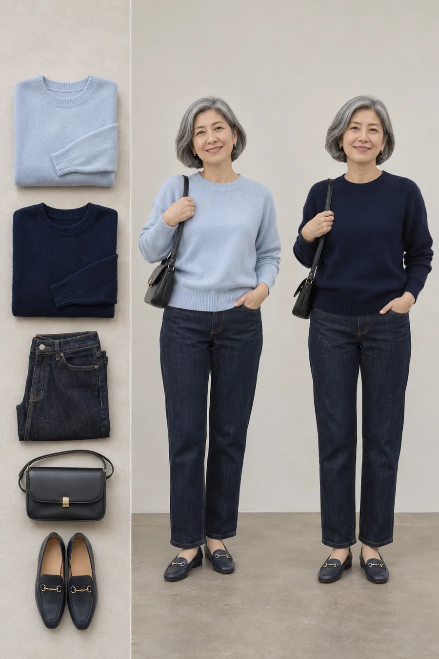
Try pale blue beside deep navy, or ivory beside chocolate. You’re checking how much depth you like next to your face. A deeper top may outline silver hair clearly. A lighter top can create a softer transition. Neither effect is automatically better. Choose the one you want to repeat.
Then check the middle. If both pale blue and navy feel extreme, medium blue may be your most useful shade. A four-season label can be a broad guide, but a note such as “medium colors work best for my everyday tops” gives you a practical shopping filter.
3. Compare soft and clear colors
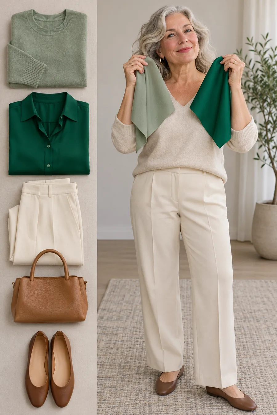
Try muted sage and a clearer green with about the same depth. The muted color contains more gray, while the clear color looks more saturated. If the first comparison also changes depth a lot, find a closer pair before deciding that brightness made the difference.
A preference for softer shades often points you toward the summer or autumn families in a four-season system. A preference for clearer shades can lead toward spring or winter. Treat that as a shortlist. Repeat with another pair, such as dusty rose and clearer rose, to see whether the preference holds.
4. Check the contrast in a whole outfit
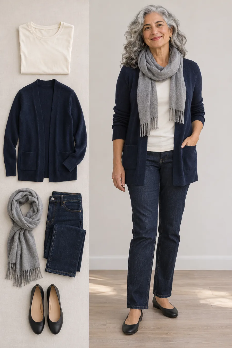
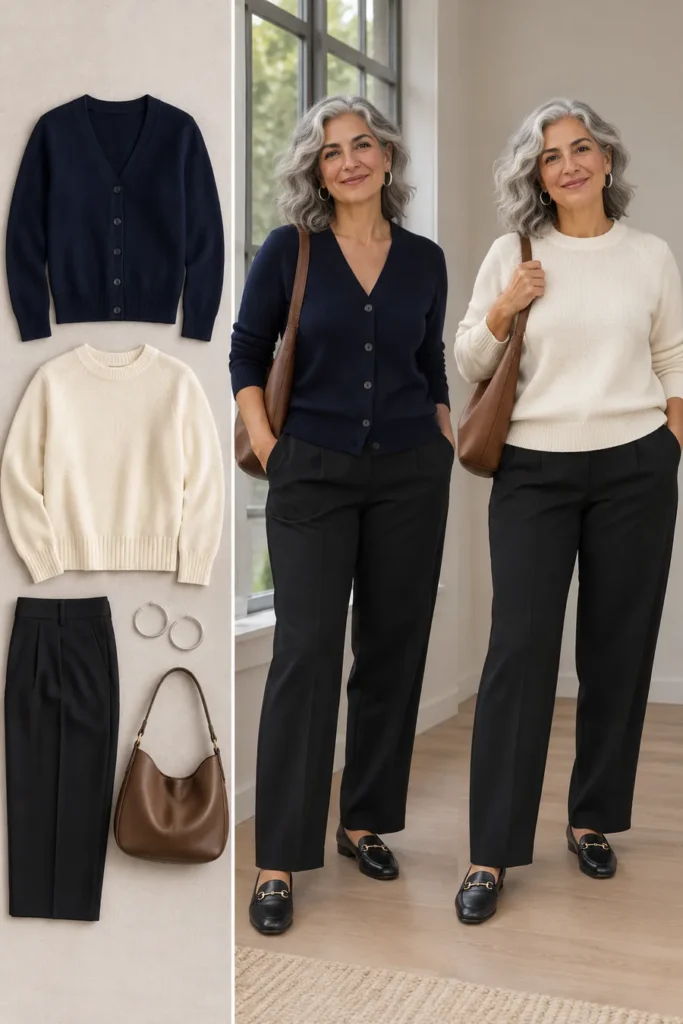
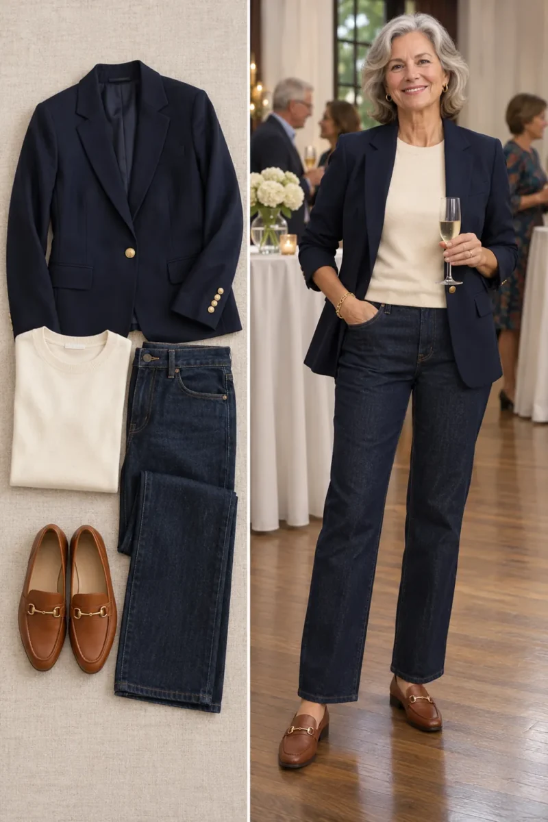
Wear a navy cardigan over ivory, then try a soft gray layer over the same tee. Look at the outline around your face and the transition between the garments. One outfit has a stronger light-dark contrast. The other is quieter. Check both close up and from the distance you would see in a group photo.
Your preferred contrast can help you use a palette. You may enjoy navy as a jacket but want ivory at the neckline, or prefer a soft gray frame around your silver hair. An outfit can contain several colors from a seasonal family and still need a different amount of contrast.
Try the seasonal families as complete outfits
Try a spring-inspired combination
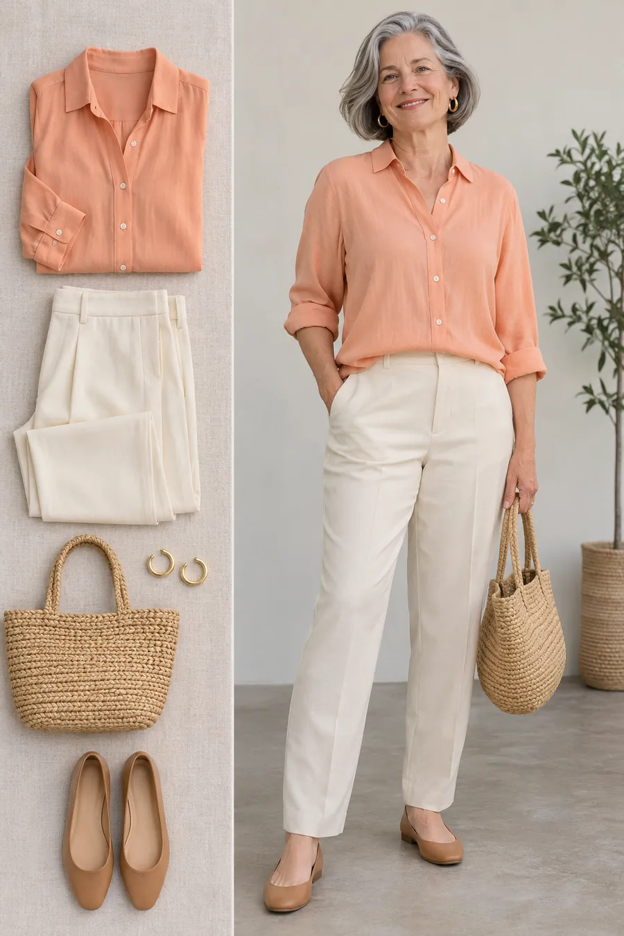
If you preferred warmth and clearer, lighter colors, try peach with ivory and tan. A peach blouse, ivory trousers and flat tan shoes make a simple daytime outfit. A woven bag and small gold hoops repeat the warmth without needing another strong color.
Spring-inspired colors can include peach, warm coral, clear turquoise and light warm green. Start with the version you actually liked in your comparisons. If peach fades into your skin, move a little deeper toward apricot or keep peach in an accessory and wear ivory as the top.
Try a summer-inspired combination
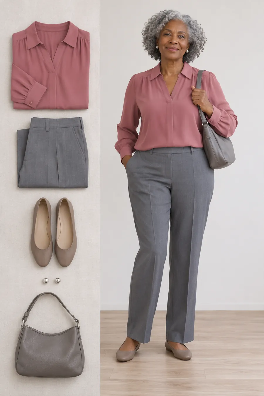
If cool and softer colors kept winning, try dusty rose, cool gray and taupe. A rose blouse and gray trousers can work for lunch or a smart-casual day. Silver studs and a gray bag keep the palette quiet. Use a deeper gray bottom if you want a little more definition.
Summer-inspired colors often include soft blue, dusty rose, lavender and softer navy. Compare a light and a medium version if the palest shades seem to disappear. You can use a deeper navy jacket to frame the lighter colors instead of replacing every piece.
Try an autumn-inspired combination
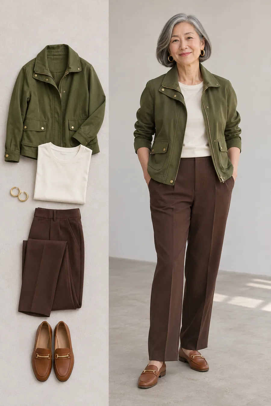
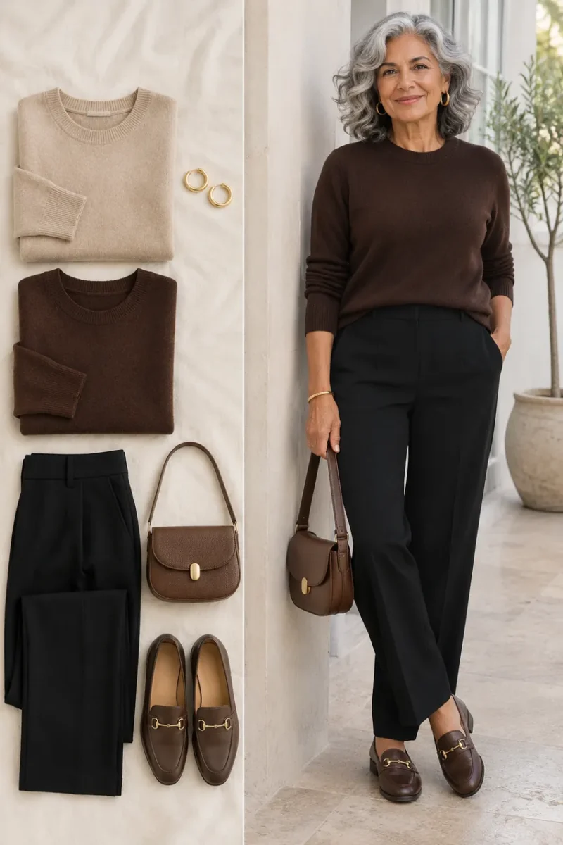
If warmer, more muted colors worked well, start with olive, ivory and chocolate. An olive utility jacket over an ivory tee and brown trousers gives you texture and enough difference between the layers. Cognac loafers and a small gold earring are easy finishing pieces.
Autumn-inspired colors often include rust, moss, camel and warm brown. If several earthy shades together feel too quiet, add more ivory or use a clearer accent. A palette becomes more useful when you can change the proportions to fit the way you like to dress.
Try a winter-inspired combination
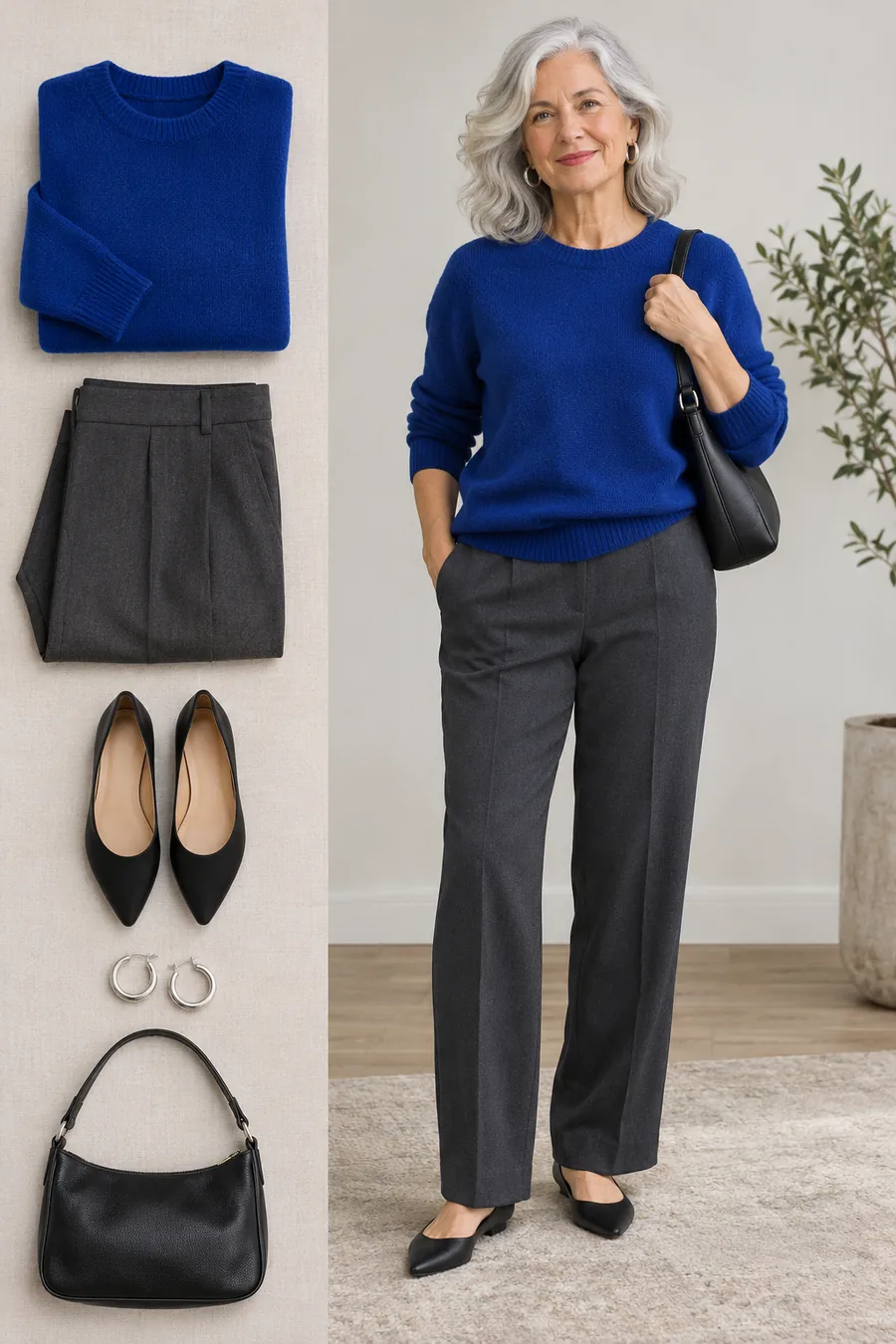
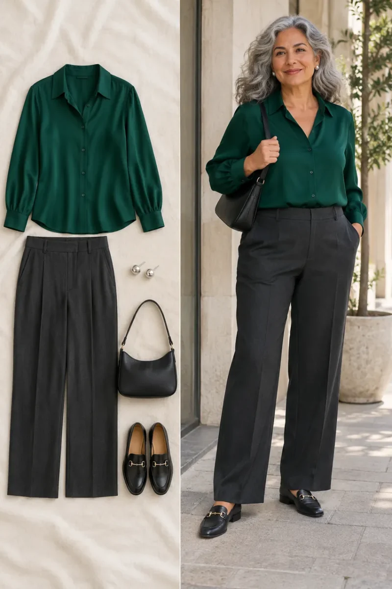
If cooler, clearer colors and stronger contrast suited the effect you wanted, try cobalt, charcoal and black. A cobalt knit over charcoal trousers gives the outfit a clear focal point. Black flats and a small bag keep the other pieces simple. Silver hoops can echo gray or silver hair.
Winter-inspired colors often include strong blue, clear berry, emerald, black and crisp white. If a solid cobalt crewneck feels too much, try a smaller amount as a scarf or a cardigan left open over white. You can still use the family while adjusting how much color sits near your face.
Use your results with gray hair and your existing wardrobe
Check gray hair as part of the frame
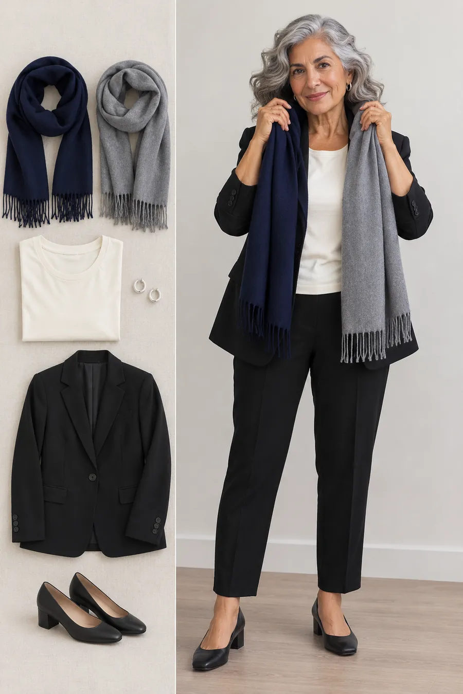
Gray hair adds a visible color beside your face, and the amount of contrast can change as it grows in. Compare navy and gray scarves over the same ivory top. Then try them with your usual hairstyle. Hair pulled back can show more skin and change the frame you see in the mirror.
Use the result to adjust contrast and placement. Silver hair alone doesn’t establish whether you prefer warm or cool clothing. Your skin, brows, eyes, the fabric and your own preference all contribute to the outfit. Keep the combinations you enjoy wearing in your current hairstyle.
Keep a favorite color in the wardrobe
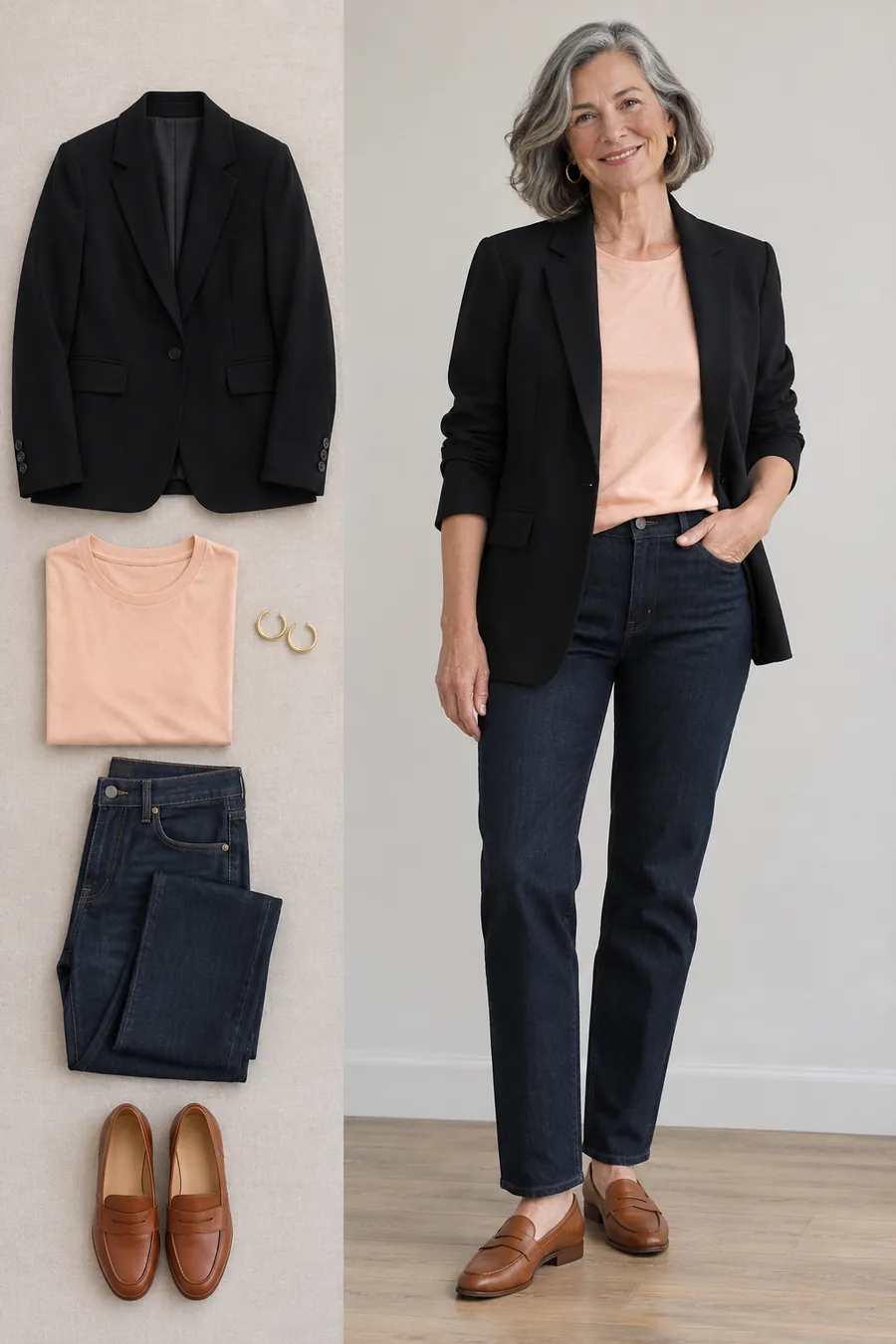
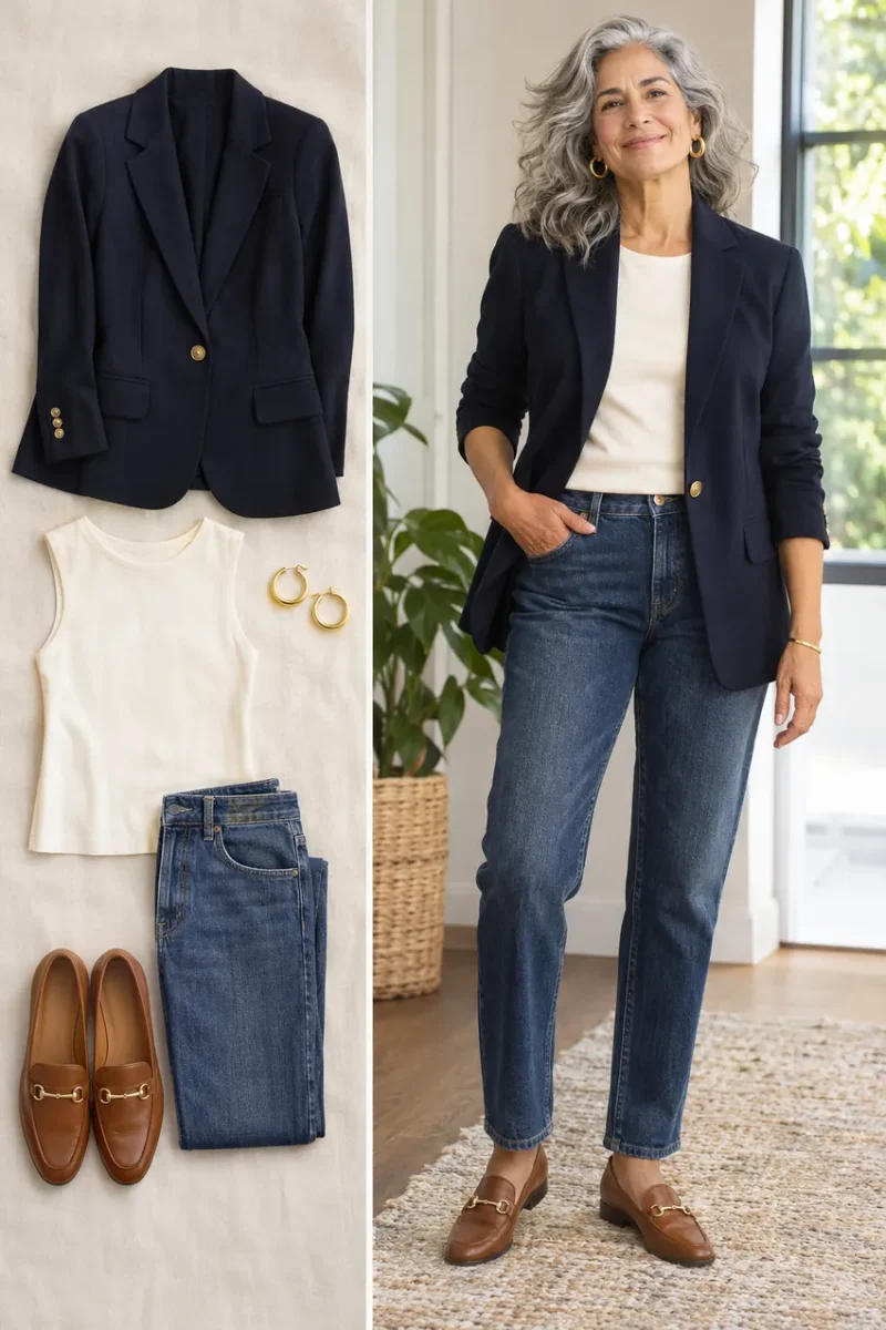
If a black blazer is useful but you prefer a warmer neckline, open it over pale peach. Dark jeans, cognac loafers and gold hoops connect the colors. This lets you test the effect of peach while keeping a jacket you already wear.
You can also put a color you love in trousers, shoes or a bag. If a high neckline makes a shade feel strong, try an open collar with a light tee underneath. The amount and placement of a color can change how an outfit feels as much as the shade itself.
Build a three-color starting capsule
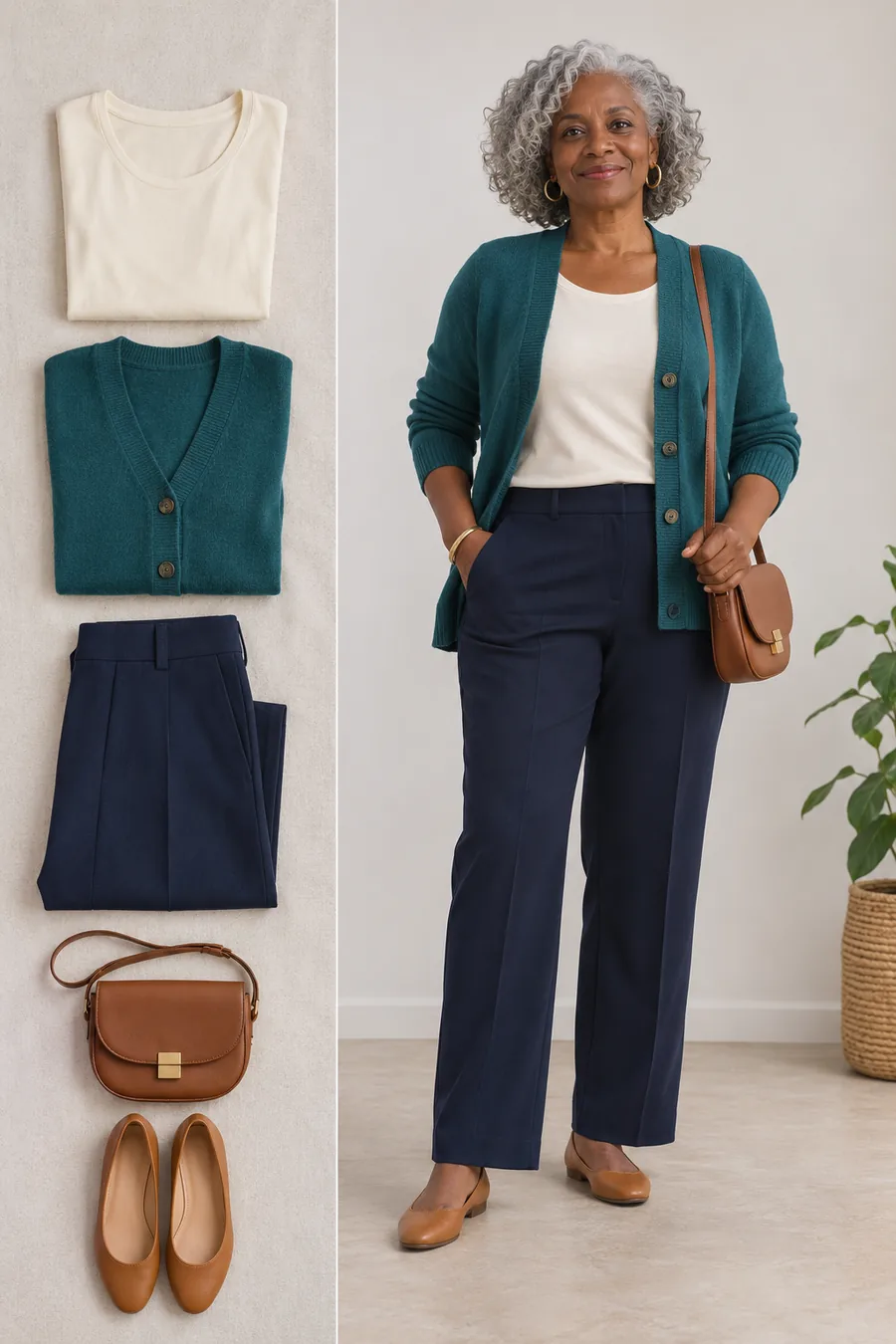
Choose one light neutral, one dark neutral and one accent from your tests. For example, use ivory, navy and teal. Start with an ivory top, navy trousers and a teal cardigan. Tan flats and a brown bag work if those are already part of your wardrobe.
Try two versions before buying anything else. Wear more ivory for a lighter look and more navy for a deeper one. Then compare whether a smaller or larger patch of teal suits the occasion. If all three combine with your usual shoes and coat, you have a palette you can actually use.
Check matte and shiny fabrics separately
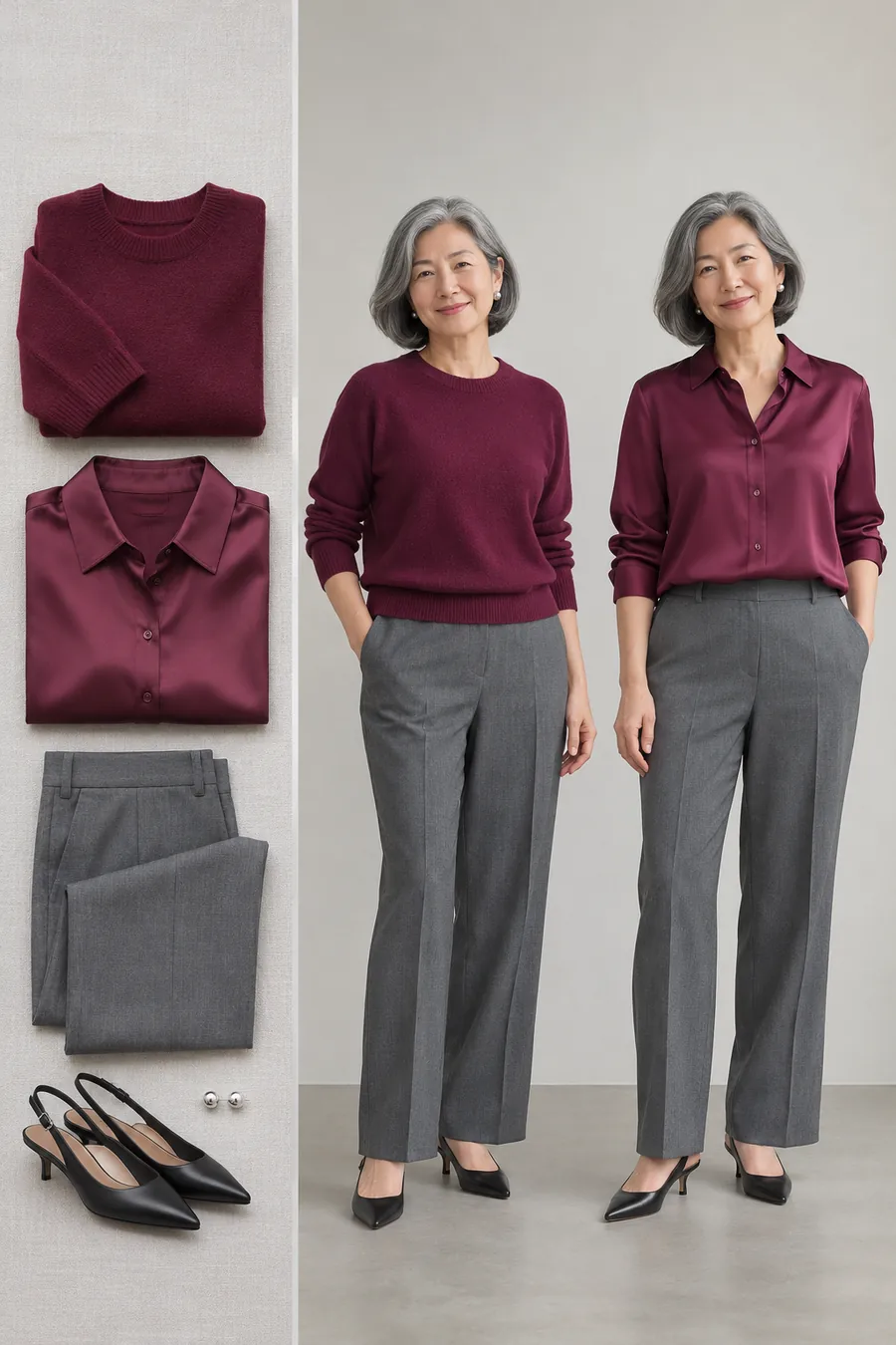
A berry satin blouse and a berry knit can look quite different under a restaurant light. Shine reflects light and can make a color seem brighter. Once you have a favorite shade, try it in the type of fabric you intend to wear, especially for an evening event.
Keep the trousers and jewelry the same while comparing. If you like the color but the satin feels too bright, a matte blouse may be the better purchase. If you want a little more light near your face, satin can provide it without requiring a different shade.
Save a useful note for shopping
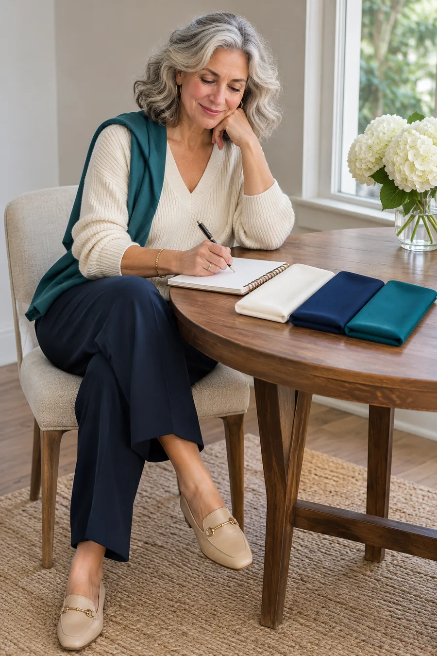
Write down three shade names, one comparison you want to repeat and two outfit combinations you liked. Add a daylight photo of the actual pieces if it helps. This gives you something concrete to use when a shop calls several different colors beige, navy or coral.
Start with one purchase that works with clothes you own. Check the selected color and size, then try it with your reference outfit at home. If the season label remains uncertain but the outfit works, keep the practical result. You can refine the note as you wear the piece.
Turn the comparisons into a shopping plan
Use a simple comparison record. Make three rows headed warmth, depth and brightness. Write the garment you preferred in each comparison, plus “tie” when needed. For example, you might record camel over gray, medium blue over pale or deep blue, and muted terracotta over bright coral. Those notes suggest a warmer, medium-depth, softer starting palette.
Choose two possible families when results split. If your warmth test ties and you prefer soft colors, compare summer-inspired and autumn-inspired outfits. Keep the depth similar in both. A dusty rose blouse with gray trousers and an olive top with chocolate trousers make a useful pair to try across two mornings. Note which outfit you would reach for again.
Keep your best neutral while testing an accent. Use the trousers or jacket you wear most. Change the top or scarf rather than buying a whole palette at once. If a family includes several colors you like but you prefer a different dark neutral, use that neutral as the base. Your color note can be more specific than the broad family.
Try the outfit where you intend to wear it. Wear the combination for a normal morning or check it under the indoor light you’ll have at dinner. Notice the fabric, neckline and comfort as well as the shade. If the color looks good but the garment needs constant adjusting, try the same shade in a different cut.
Decide whether an in-person analysis would help. A session with a color consultant can be useful if you want more comparisons or keep getting inconsistent results at home. Ask what is included, how they use drapes and whether you can compare colors you already own. Take your notes and explain which outfits you want help building.
Frequently asked questions
Does going gray mean my season changes?
Gray hair changes the colors and contrast around your face, so it can be useful to revisit outfit combinations. Use actual fabric comparisons and your current hairstyle when deciding what you like. A hair color by itself gives you only part of the picture.
What if I sit between two seasons?
Keep both as a shortlist. Start with colors you liked from each and use one familiar neutral underneath. You may get more use from “soft colors at medium depth” than a single season name.
Do I have to buy a seasonal swatch fan?
You can start with clothes you already own and a notebook. A swatch fan can be a reference if it matches the palette you want, but it is still worth comparing the actual garment and fabric in daylight.
Can I use gold or silver to decide my season?
Compare similar pieces in the two finishes if you want a supporting clue. Give more weight to fabrics near your face and to the outfits you enjoy wearing. Jewelry size and shine can influence what you notice.
What if my favorite color sits outside my palette?
Try it as trousers, a bag or shoes, or wear an open jacket over a neckline shade you prefer. You can also keep wearing it near your face if you enjoy the result. Use your palette to make decisions easier.
More color help
For more warm and cool comparisons, use our six undertone tests. Then compare our guides to warm undertone colors, cool undertone colors and colors to wear with gray hair.
Further reading
For the color dimensions used in a seasonal system, see Kettlewell’s introduction to color analysis and The Concept Wardrobe’s seasonal color guide.
Leave a Reply